The latest release of Kinopio lets you work offline while in a subway, plane, or uncharted rainforest. When you come back online, your changes will be synced back up. And because the app no longer needs to wait for a network before loading, it starts up almost instantly.
🛫 Editing the Kinopio roadmap in airplane mode
Full offline support was the byproduct of building for speed and immediacy. From a multi-storage loading process, to a queue system to save grouped changes, and a UI status system to inform and reassure users – many separate systems come together to enable an experience that responds fast and works everywhere.
If you're curious, the overall architecture of Kinopio is described in
How Kinopio is Made
Multi-Storage Loading for Speed and Truth
While running Kinopio, if you peek inside the Storage tab in your web inspector, you’ll see that each of your spaces is locally cached under a space-ID key with a stringified JSON value containing cards and other attributes that gets updated as you work.
This local-first approach is what enables new users to immediately start using the app without an account – because the best way to learn how to use Kinopio is by using Kinopio.
The kinopio-server enables editing your spaces on other devices, sharing public spaces, and real-time collaboration. In scenarios like these, the remote data on the server acts as the source of truth. But reading/writing remote data from servers is much slower than cached local data.
When loading a space, we can use both local and remote data together to get the best of both worlds, local speed and remote truth. The process goes something like this:
A helpful side-effect of this loading system is that when you’re offline, you’ll still be able to open your cached local spaces.
Grouped Updates Through an Operations Queue
In most apps there’s a 1:1 relationship between user actions and server routes. In a social media app when I write something and hit the Post button, my post is then saved to a server so that others can read it.
But in the case of Kinopio, items like cards and boxes which need to show updates in real-time as you interact with them, this means a new update on each keystroke when you type in them, and on each rendering frame while being dragged. But of course you can also paint-select multiple cards and move them around together, so potentially that’s >100s of updates a second.
The x, y, width, height of the selection box is being broadcasted to collaborators in real-time
If I was sending server requests for each update, even regular use would bang against the rate limit that exists to prevent the server from crashing.
Instead, all updates flow through centralized update methods which update: the local cache, app state, real-time broadcast stream, undo/redo history, and adds the update to the API operations queue so that multiple updates can be grouped together and sent to the server in a single request.
Especially worth noting is that operations currently in the queue are saved in localStorage, so if they fail the queue can be resumed later when connectivity improves.
Bringing It All Together with a UI Status System
Once you have systems that are local-first and resilient to connectivity issues, the actual loading the app offline part almost writes itself.
For offline loading, the vita-PWA build plugin generates a PWA manifest and service worker that instructs the browser to cache the app and its asset files locally. And when new releases are shipped, the browser updates its cache to the new version.
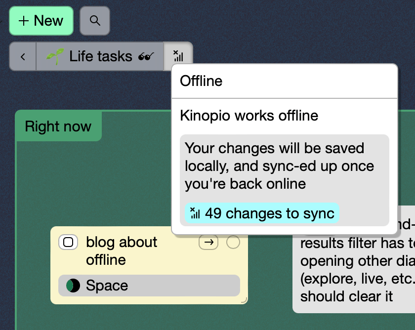
The last thing needed is to do is inform the user that Kinopio works offline and reassure them that their changes will be sync-ed up once they’re back online.
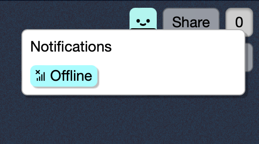
Offline status button and dialog
While offline, it might surprise users to learn that certain features aren’t available offline because they depend on the server, like global search. Those features display a little clickable offline info badge. Other features are more obviously not usable offline, like social or discovery feeds, which can just be hidden.
Clicking the badge opens the Offline dialog
Essentially, I went through every dialog and button and decided whether I could either make it work offline, show an offline badge, or whether to hide it entirely.
Offline Is the New Luxury?
While using Kinopio offline to test features and write this post, I realized that working this way is a really nice way to concentrate even on my desktop computer.
I’ve never heard a productivity influencer say “hey just go offline sometimes”, but the offline web is here, it’s speedy, it’s the original focus mode.
My earliest blog was pretty emo – totally what you’d expect from a teen of the 2000s. But what made it fun for me was the comments. New internet friends from around the world would comment on my posts and I’d comment on theirs. Before we knew it, we were a little community.
But for all the good times, comments come with the responsibility of guarding against spam and toxicity. In other words, it’s a job. But building our own communities is a job worth having in a world that’s noisier and spammier than ever.
On one side of the web, we have social media sites with engagement (i.e. outrage) driven feeds that keep us coming back. On the other, smaller sites and apps that are oases of calm in the storm – but which rarely give us a reason to return.
The good news is that it’s a lot easier to make an oasis engaging than it is to chill out at a nightmare mall. So maybe we can have it all?
How to Build a Comments System
Whoa wait, this might not be something you want to build yourself. I originally thought it’d take 2 days, but it took 2 weeks. Not just because I’m bad at estimates, but because my view of commenting was way too simple.
There was a time when this is how all early comment systems worked during those short-lived early days of trust and harmony on the web. But these days we need to also consider spam and toxicity.
Designing secure systems is easy. But designing slightly less secure systems that people actually want to use is way harder because you’ll have to choose the right tradeoffs for your specific goals.
As for my goals:
Easy to use: as close to a classic commenting flow as possible; no sign up required
Robust and timeless: This blog predates and will probably outlive most companies and their current authentication systems, so there is no “sign in with Google/Facebook/Github/X”
A reason to come back: commenters can opt-in subscribe to email notifications of future comments on that post
Reward trustworthy commenters: repeat commenters and those with kinopio accounts will get little badges
Enjoyable details: commenter info (name, website, etc.) is saved so you don’t have to retype it next time. In-progress comments are backed-up as you type so if your browser crashes you won’t lose any work.
Spam resistant: first time comments need to be approved, and all new comments are reviewed. More details on how moderation works below.
So here’s what the commenting system looks like now,
Scope … increased
⏰ And lastly, every 2 hours the server checks to see if there are any new comments. If so, an email is sent to the subscribed commenters on that post.
If you’re looking for an easy alternative, I hear commento is pretty good. The reason I didn’t use it is because its sign in model didn’t fit with my goals. But also because it’s been years since I’ve been able to code just for fun – so I guess this was like a holiday gift to myself.
I hope this inspires you to add comments to your own blog. I had to leave out a lot of details to keep this readable so if you have any questions… leave a comment! _φ( °-°)/
A couple days ago I was emailed by Pema about her thesis paper,
I’m studying the impact of digital productivity tools on the user psyche, the concept of digital gardens, and technology designed for reflection. Naturally, a lot of Fog Creek Software’s work came up and I’ve been following your work on Kinopio! I’m fascinated by its evolution and would love if you could answer questions on your philosophy on task management, digital productivity tools, and your intentions with Kinopio!
I thought you might be curious about some of these questions too, so here goes:
Question 1
Why did you make Kinopio, a tool not to manage/optimize tasks, but one for brainstorming and reflection? What were the intended outcomes for users when using a tool that “works the way your mind works”?
The idea originally came from my use of design tools like Sketch. When making mockups for work, I noticed that I was using the text tool to figure out the why and the how behind what I was doing. Unlike writing in a linear document, it felt really creatively free-ing and I wanted to bring a better version of that experience to everyone else.
The more I learned about the field, the more I understood why writing this way felt so right. We’re spatial creatures, with brains designed to associate feelings and thoughts with places and landmarks.
It’s a little depressing that these days we mainly use computers to consume fast and react fast. Task management turns us into more productive human machines. Rather conveniently for managers, human machines have higher predictability and lower inherent value – they’re easy to automate, replace, and erase.
Productivity is important, but it’s just one piece of a bigger world. The history of computing, from WordStar, to KidPix, to HyperCard, to HTML, is the history of creative software designed primarily to help us understand and express ourselves.
Question 2
I see that Kinopio has 5 design principles, unique from the mainstream software landscape. Why this philosophy in general?
The principles behind Kinopio are a reaction to seeing the results of the opposite ideology in previous workplaces. It wasn’t explicitly stated, but if I had to describe the average software company’s lived philosophy, it would look something like:
1. Go big, or go home
2. Low-friction above all else
3. Design for the lowest common denominator
4. Many teams, in many silos
5. No time for refinement, this will be someone else's problem
This philosophy is ironclad but never explicitly declared, because it’s never questioned. Most leaders just assume that’s just how things are, or need to be.
When you’re on the inside, each of these on it’s own sounds reasonable. But taken too far, without nuance, and without an understanding of why, eventually leads products to enshittification.
Question 3
The ‘clean’, minimal experience is a design principle in UI UX today… You reject this in Kinopio. How does this affect the user? Are there other UI UX principles of design you do not subscribe to?
Our inspiration shapes what we build. If all you see is clean minimal product design, then you’ll inevitably make the same. I think that’s why art schools teach art history in year 1, because knowing the varied history and styles of your medium – software included – really helps expand your perspective of what’s possible, interesting, and cool.
Minimalism as an art-style is a pretty tight leash. But if you think of ‘less’ as merely one of many possible techniques used to not overwhelm or confuse users, then you’re in the right place to ask yourself questions like Why is this confusing? From there, maybe you can use other techniques like contextual relevance, or a more intuitive layout, to make important options less confusing, instead of hiding them.
I like to think of Kinopio as a professional tool, like a keyboard synthesizer, or a race car. If you were going 200mph would you rather find your controls inside a clean/minimal/aesthetic menu, or just hit some upfront buttons and dials?
Your third principle emphasizes the power of plain text for the user. What are your thoughts on empowering users through Kinopio? What is Kinopio’s relationship to its user?
There’s billions of people on earth, and provided you don’t owe your investors millions of dollars, the software we make doesn’t have to cater to the lowest-common-denominator. For both users and designers, products that are made for a specific group of passionate people can feel like a glass of ice water in a desert. This requires me to be deeply connected to the community in order to understand their needs – and for them to understand mine as well.
To use another physical example, Leica cameras cost way more than their competition and don’t take better photos. But Leica is able to thrive by building cameras with a more opinionated manual-focus-only shooting experience because there are enough photography enthusiasts out there who appreciate the result of those opinions.
Question 5
Can you describe any unexpected outcomes or challenges that arose from developing Kinopio? Were there any unanticipated user behaviors or outcomes?
To be honest, I didn’t expect it to be this hard. To make the business sustainable there’s many new skills like marketing, and being on camera, that I have to get a lot better at.
But having to wear so many hats, you also start to notice patterns. Like the deep anxiety that comes before trying something new, then being okay with sucking at it, and then maybe one day being pretty good at it.
Question 6
How did you measure the success or effectiveness of Kinopio?
📈 The quantitative measures I use are basic things like unique page views, and the revenue numbers reported to me by Stripe. The subjective bits are things like how many people are editing public spaces Live right now, adding their spaces to Explore, or hanging out in the Discord.
Question 7
Have you found any patterns or insights regarding user behavior and psychology through the data collected by your tool? How do you use this information to continuously improve the user experience and provide more effective features?
I don’t perform any analysis of user data so everything I know about users I get anecdotally, and through the feedback I get from sharing works-in-progress. But because I’m building Kinopio as much for myself to use as for others, I’ve got no shortage of features to build, and ideas on how to refine the user experience.
Question 8
Did you encounter any ethical dilemmas during the development process? How did you approach and address those dilemmas while still meeting the intended goals of the tool?
The only thing I can think of is related to funding. It’s something I’ve been approached by investors about in the past, and while I’m grateful to anyone who sees potential in Kinopio, this also led me to come up with the term Organic Software to describe why I’m wary about the long-term ramifications of taking traditional VC.
Question 9
How do you envision the tool evolving to better support users in their personal and professional growth?
Like any kind of growth, it’s a slow, continual process. I have some big feature ideas, and a lot of little quality-of-life improvements. I also have ideas on how to make the community feel like even more of a community. And I also know I need to try new things to get the word out to more people about Kinopio.
This post is adapted from a talk I did at the Design Matters conference in Copenhagen.
I’ve been working on Kinopio for over 4 years now. It’s felt more like building a house, piling up little bricks and wood planks, just a little bit each day. Except that, this house is never finished.
Something I learned from my time at Glitch, was that before you get too deep into the process of building, you should write out a short list of product design principles.
The more unique and definitive your values are, the more useful they’ll be as a decision making tool later on.
These are some of the principles that I use to design (and redesign) Kinopio:
1. Embrace smallness
2. Build for fidget-ability
3. Embrace plain text
4. A single interface for mobile and desktop
5. Refine by pruning
Principle #1
Embrace Smallness by Embracing Code as a Living Design System
Being bootstrapped means that resources are tight. But that’s it’s own kind of blessing. When you feel constrained, you’re naturally drawn to simple and basic tools and processes.
When planning out a new feature, instead of using design software to draw and arrange buttons, inputs, and dialog windows into detailed mockups, I skip all that and jump right into real code with <button>, <input>, and <dialog> elements.
Here’s the HTML part of a dialog window component (using pug):
<template lang="pug">
dialog.narrow.dialog-name(v-if="visible" :open="visible")
  section
    p blank dialog, please duplicate
  section
    button(@click="incrementBy")
      span Count is:
    p Current theme is:
</template>
In the spirit of keeping things simple, the UI is described mostly using regular HTML tags and the layout basically designs itself.
The way that works architecturally, is there’s a global parent file (App.vue in my case because I use vue.js) which contains global styles that all the other child components inherit from.
Relatedly, it’s pretty satisfying to make things that are efficient, small, and fast. Maybe it’s the craft-like part of engineering.
Embracing smallness also means being diligent about only adding small third-party dependencies and utility libs that do one simple thing like date manipulation or generating random colors.
Partly because of this, Kinopio only weighs ~220kb with libs and assets. So in an alternate dimension where we didn’t have the Internet, but still had HTML, I’d ship kinopio to you on a single 3.5mm floppy disk (and it wouldn’t even need to be a high-density one)
Principle #2
Building for Fidget-Ability, hmmm
The first time I really thought about fidgeting was in the early 2000s when I learned that the faceted curves on this Japanese cell phone were explicitly designed for you to run your fingers over when you weren’t using it.
Software Design is usually focused on capturing user inputs and showing outputs. But most of the time we spend using software tools, we’re actually in between those two actively engaged states.
This is what I call the “hmmm” state.
As in, “hmmm, what should I write next?” Or, “hmmm, I’m highlighting this text while reading it to help me focus”, Or “hmmm, I’m swiping back and forth on my phone homescreens while I figure out what I want to do”,
This in-between time is a great time for fidgeting.
One way that Kinopio designs for fidget-ability is having cards ‘stick’ to your cursor when you hover over them. Once you get too far away, they bounce back.
There’s a handful of little details that make this fun without getting in your way.
sticking only starts after your mouse has rested on a card for ~200ms to prevent things feeling too sticky.
Cards stop sticking when you’re near a clickable button on a card, like a tag, a link, or a todo checkbox, so you can still be precise when it matters.
This also happens to be an example of a feature that couldn’t be conceived through mockups, and required a lot of fine-tuning with real code to make work well and feel good.
Principle #3
Embrace Plain Text
Text – even markdown – is not just for nerds and programmers. Text and full URLs are atomic units of computing: it’s copy-able, paste-able, and the most flexible way to share.
Embracing plain text also helps you turn regular people into power users because they can build on top of the skills (like ctrl-c, ctrl-v) they already have.
In Kinopio, almost everything in a card is just text that supports basic **markdown**, and a couple other custom syntaxes like [[ for tags, or a file or website URL.
When the card name changes, a hyper-fast custom parser (i.e. a crap ton of regexes) splits the text into html segments based on whether that text is plain text or a special content type like bolded text, tags, an image URL, or any other kind of URL. and uses those segments to render the front of the card.
This parser and segment system is some of the most complex code in the app – but I like that the effect feels effortless to everyone else.
Principle #4
A Single Interface for Mobile and Desktop
One of my pet peeves is the premise that if you’re viewing something on your phone that must mean you need a ‘clean’ minimal experience.
Platform
Supported
Desktop
Everything
Mobile
☹ Read only, or a quick entry UI only
Screw minimal – I want to do real work wherever I want. This is how it should be:
Platform
Supported
Desktop
Everything
Mobile
Everything
Building an interface that works everywhere requires considerations that you need to bake in from day one this principle means that you can’t rely on hover to reveal controls. You need tappable alternatives to keyboard driven commands. And, of course, there’s way less room to fit things into – especially when the onscreen keyboard is up.
Another habit I picked up at Glitch was to upload old mockups and screenshots somewhere that I can reference later.
When I go back in time to something like this original version of the card editing view, I’m reminded of the basicness of it.
Back then cards had fewer options: you could only remove the card, or add a decorative frame. Although I much prefer the flexibility of cards today, it’s undeniable that there was much less to figure out back then.
Inspired by this, I habitually re-evaluate whether features are still needed and used often enough to justify their existence.
Here are just two big features I’ve removed over the years:
Removed: Minimap [2 Weeks of Work]
Hold shift down or click the button in the bottom right to toggle on the minimap. Drag the window around to adjust your view, or tap anywhere to jump.
Unfortunately, no one really used the minimap because it was out of sight and mostly out of mind. I considered placing a persistent minimap in the corner but doing so compromised the feeling of a sense of place within a space (and it wouldn’t fit on a mobile screen anyways). After adding space zoom out I removed minimaps because they were now redundant.
Removed: Save Twitter/X Threads [3 Weeks of Work]
Import Twitter threads into your spaces from a tweet card. Or create new thread spaces by replying to on Twitter with @kinopioClub save
There are whole entire products built around saving Twitter/X threads, and people had requested it, so I was confident this would be a win.
But after all that work, tweets were being saved only once or twice a day. So after Twitter/X became increasingly hostile to developers, it was an easy choice to delete all Twitter/X-specific features from Kinopio.
Both of these features demo-ed really well and got a lot of likes on social media. But in the real world, all they did was take up valuable UI space, and their code would inevitably become a maintenance burden.
🔪 The most satisfying and direct way to handle complexity is to excise it like a tumor. But removing things has it’s own problems and needs it’s own special considerations and process…
Removing a Feature Is a Community Effort
The problem with removing things of course is that every feature has at least one person that relies on it. So it’s impossible to just remove something without someone feeling bad.
Compounding the problem, the longer things stay the same, the more people get attached to them working the same way. So the older and more advanced a tool gets, the harder change naturally becomes.
This makes pruning hard work – but it’s also an opportunity to build and strengthen the community around a tool.
Share what you’re thinking of removing and why. The people most passionate about your product want to be as close to decisions as possible. I’d post this in Discord and on the Forum.
Listen to what everyone has to say. See where the feature fits in their workflows and whether there’s an alternative way they could accomplish what they want to do.
Be prepared to be wrong and change your mind if you overlooked something.
The hard part of being a designer or a coder isn’t design or code – it’s convincing people, and understanding and responding to their concerns and criticism.
Good principles exist to make you feel pain before your users do. They should guide and constrain you into thinking creatively about how to handle complexity.
Special thanks to Aneesha and Xhfloz for helping edit this.
If you're curious, the overall architecture of Kinopio is described in How Kinopio is Made