Futureland is a journaling platform that helps you build habits or learn new skills through daily posting and activity streaks.
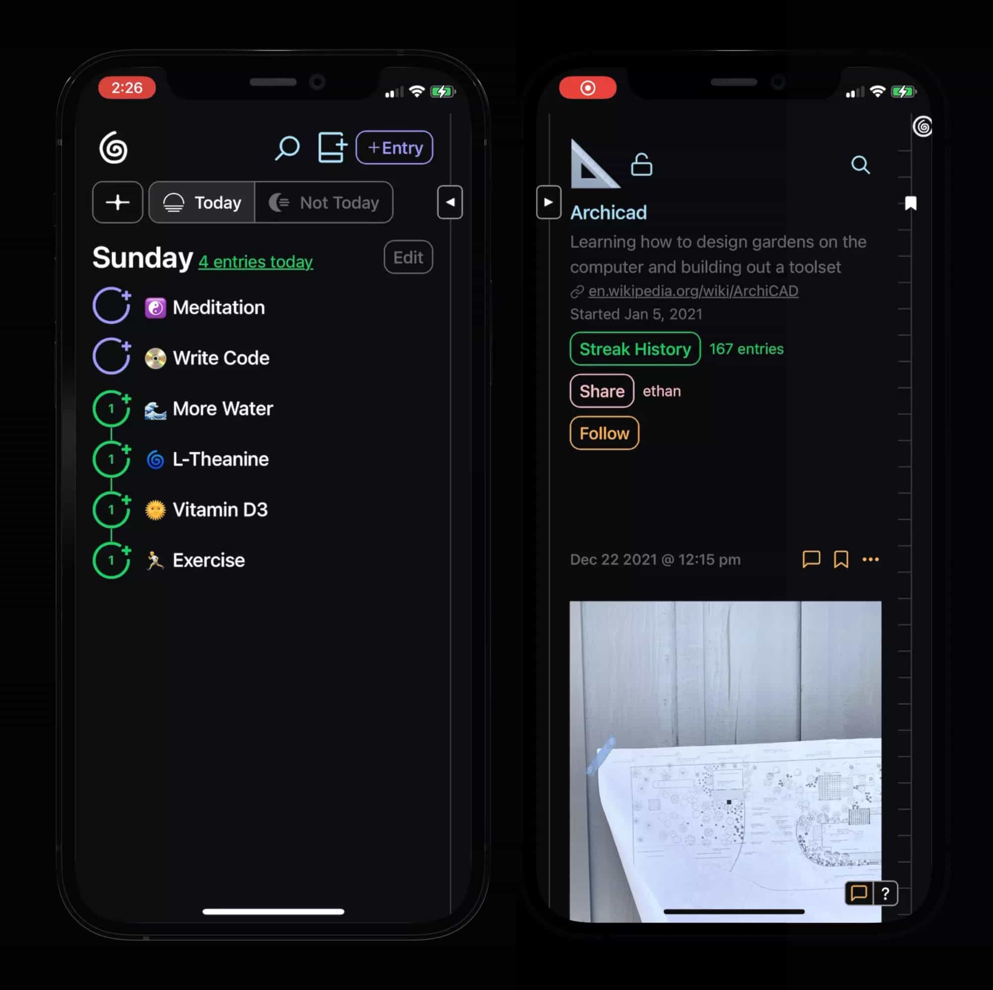
This is the tale of my redesign of the Futureland (FL) web app over the last year – how I started, what I did, and what I learned.
How I got Involved
I chanced upon FL when looking for a place to write rough thoughts and development diaries that I wanted to share. Creating journals and posting was straight-forward, and I liked it’s light-weight feel, simple aesthetic and tight-knit community,
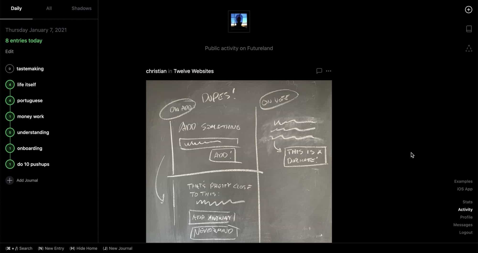
But while trying it out, I kept giving myself paper cuts on confusing parts of the interface,
- The sidebar grouped journals under ‘All’,’Daily’, and ‘Shadows’, but it was never explained what these meant
- On small screens, important controls were hidden inside a hamburger menu, or removed altogether
- When opening a journal, the sidebar that listed your journals would slide away, with no obvious way to get it back
The cumulative result of these paper cuts was an interface that appeared minimalist but required regular pauses in workflow to remember how to use.
I posted about these issues, in case it was helpful, with no expectation of anything more coming of it. But the founder and lead developer, Vin and Lucas replied, and later on asked if I’d like to help make FL more usable.
My goal has always been to work on Kinopio full-time. But especially back then, the extra money would be very much welcome, to stay alive and occasionally buy nice things.

Step 1, Fixing the Floor
Making mockups is easy, communicating is hard. So the first thing to do was establish a shared foundation and vision. I started by asking questions to understand the thinking behind the existing design, and by collecting feedback from the community.
Adapting Maslow’s hierarchy of needs, I proposed a pyramid of needs for Futureland, with basic usability as it’s foundation.
FL already had vocal power-users who’d climbed it pretty high up the pyramid by being manually 1:1 onboarded by Vin, but basic usability issues still slowed them down and were a barrier for newcomers.
🕊 The first way to make an interface feel intuitive is by grouping together related controls.
It made sense to do this by making the sidebar the ‘home’ of the interface with new responsibilities,
- Primary: Organizing and navigating journals, teaching tips
- Secondary: Creating journals, user profile, search, discovery
I started by proposing little adjustments and drawing new icons and controls for basic journal creation and navigation. By necessity, I was already updating the visual appearance of controls to fit inside the sidebar
Now that the fundamentals were set, this was a good time to step back and shape an aesthetic unique to FL.
A New Look with Functional Colors
We used Kinopio to create a Mood Board space.
I started with Vin’s original inspirations which I described as sleek, graphic, minimalist
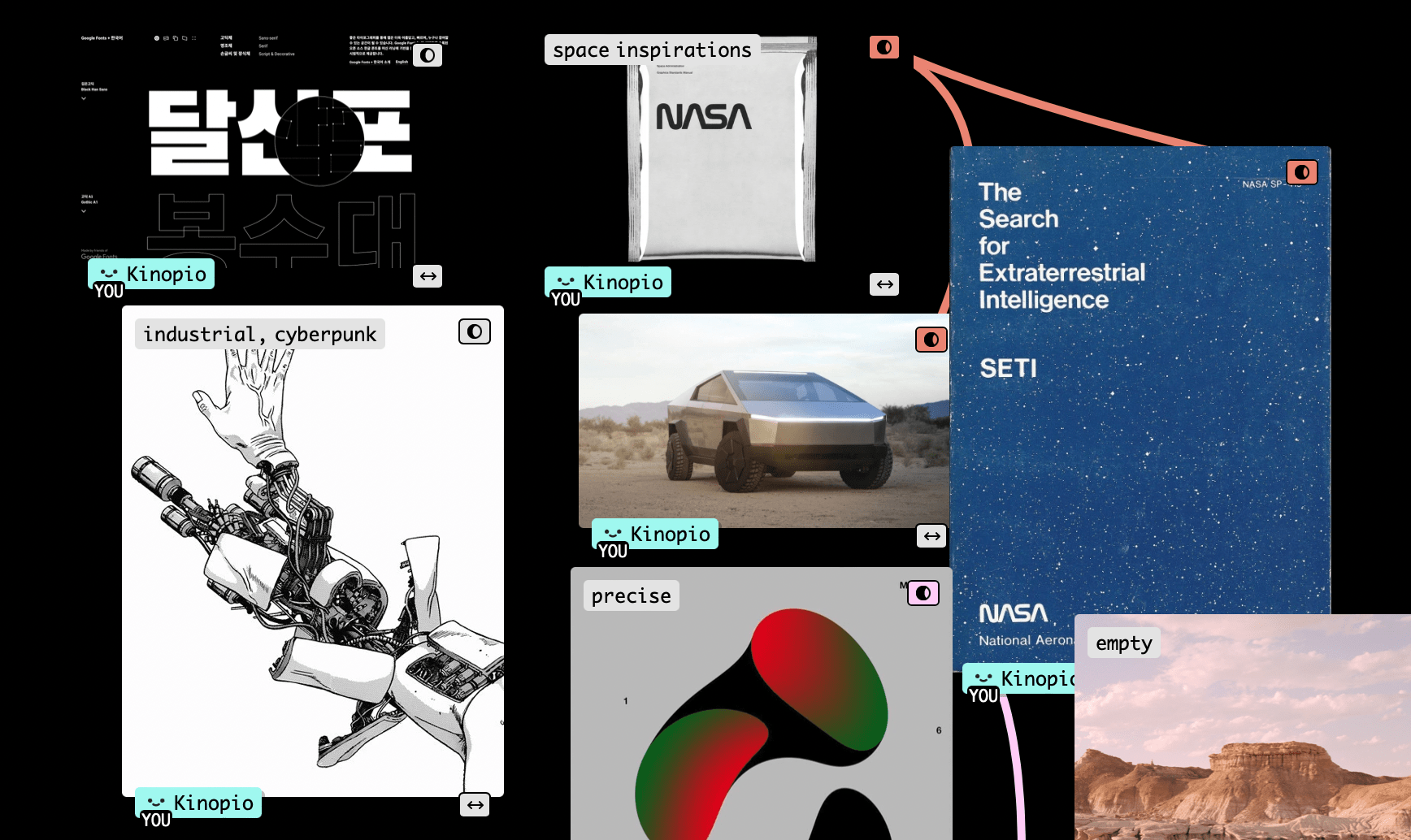
We then added new images and commented on what we liked about them,
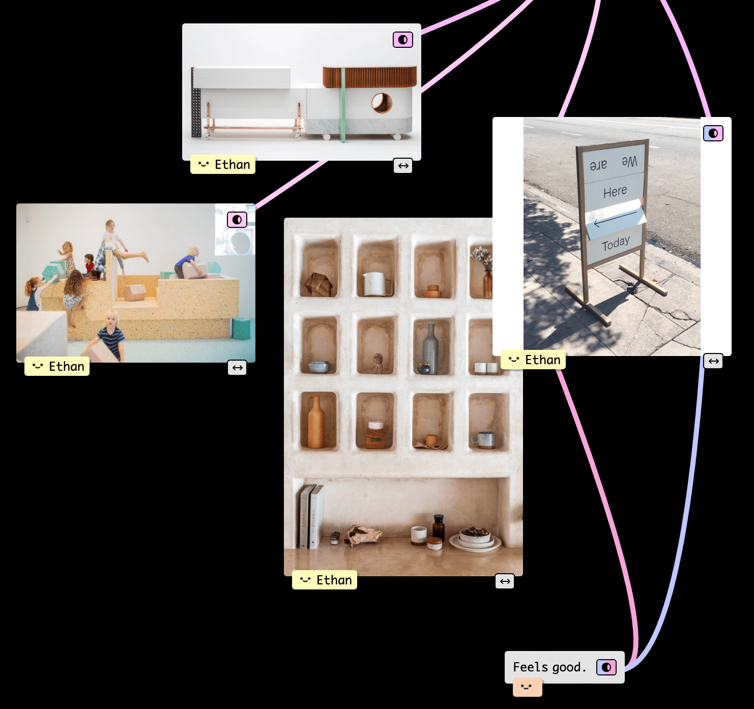
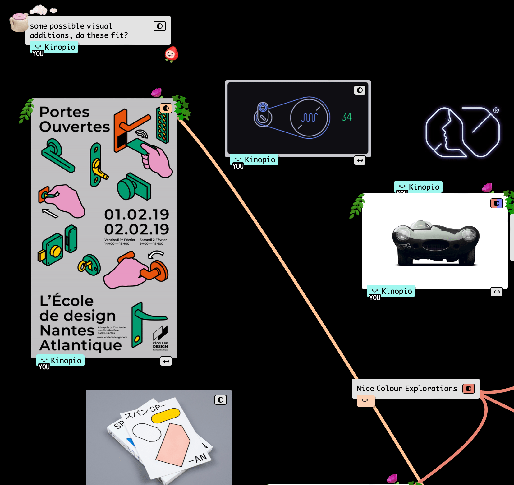
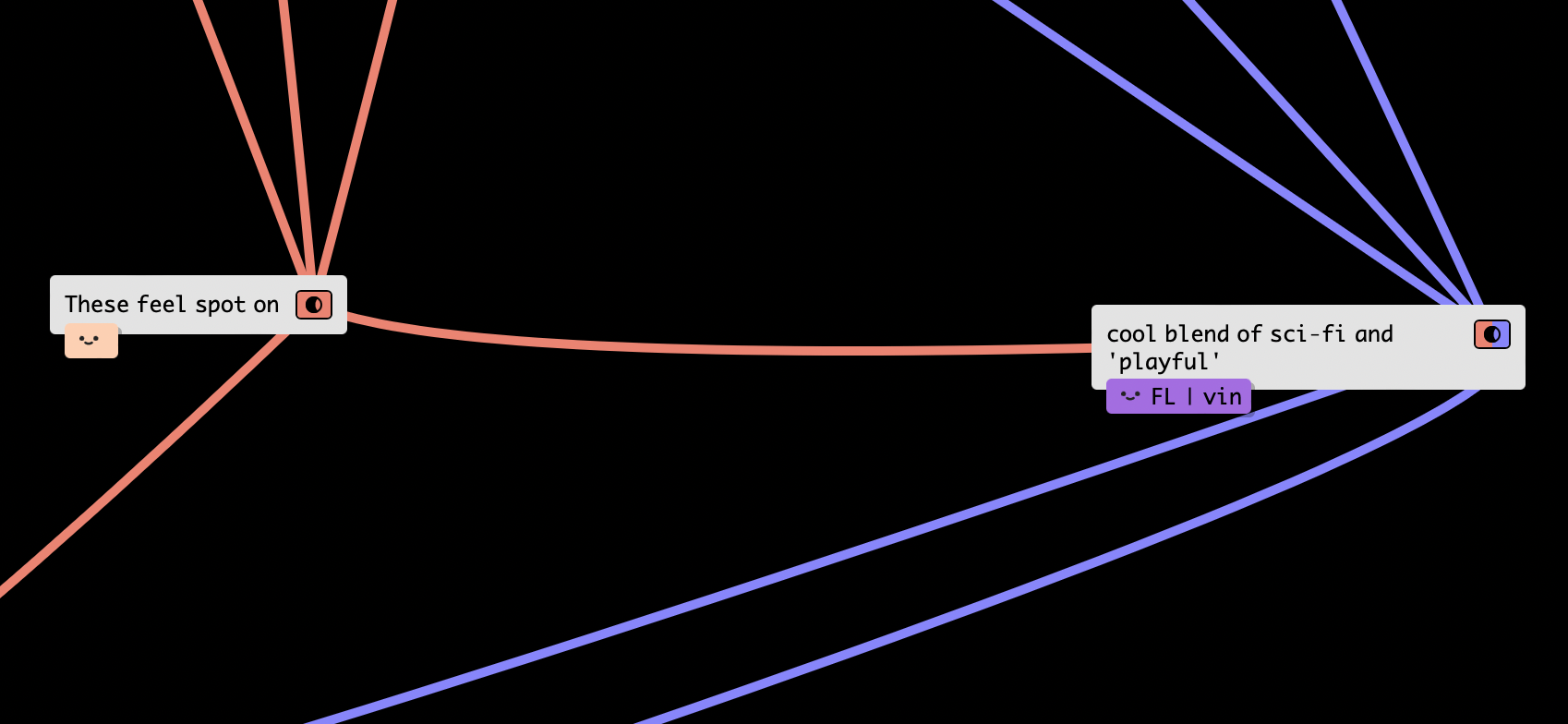
One of the themes that resonated were bright spot colors,
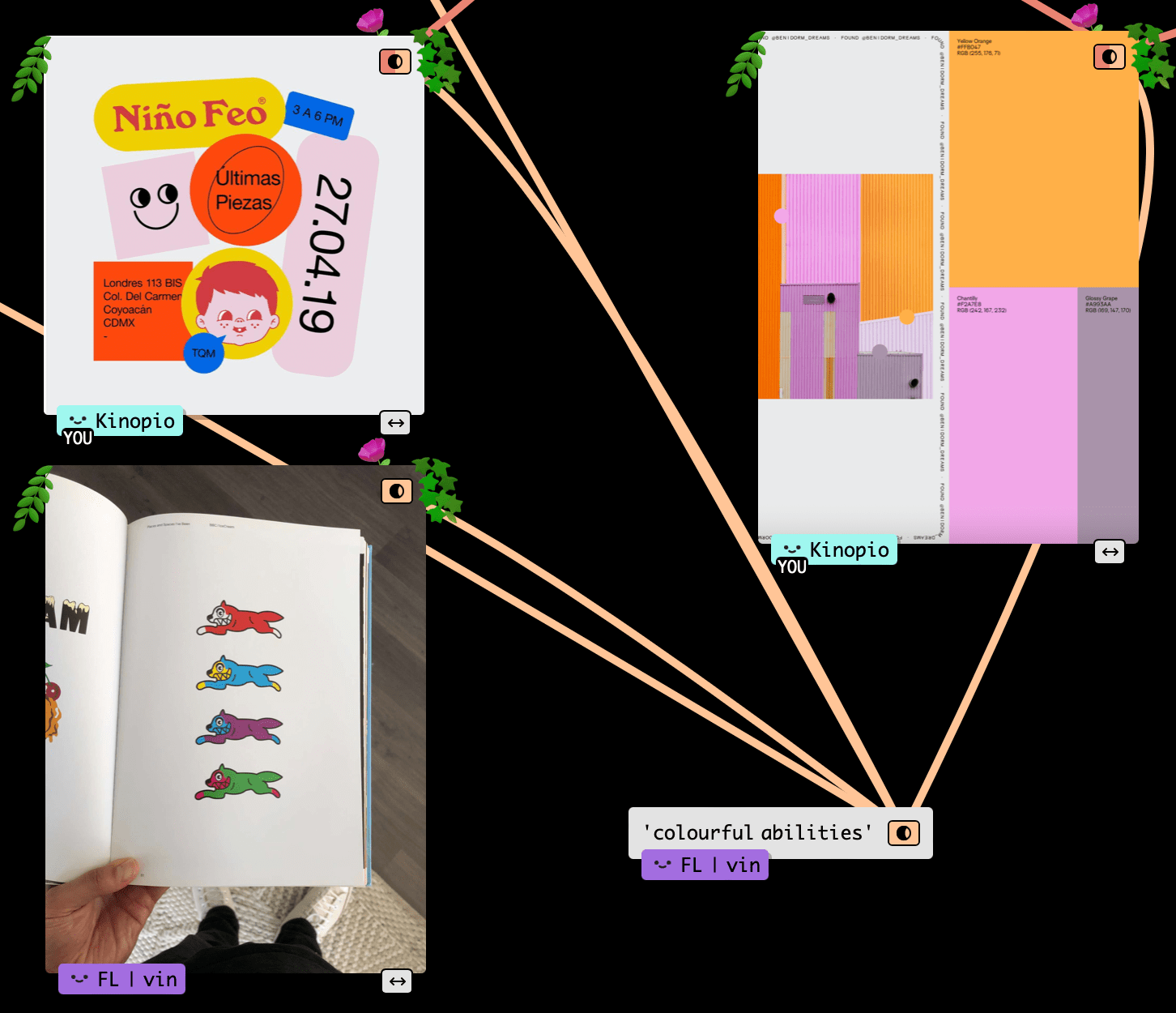
This gave me the idea for tying color to function. Users wouldn’t need this to explicitly explained – they would naturally form associations between like colored controls which would help them parse and learn the interface.
| Function Color | Related To | Example |
|---|---|---|
| Green | Activity Streaks | 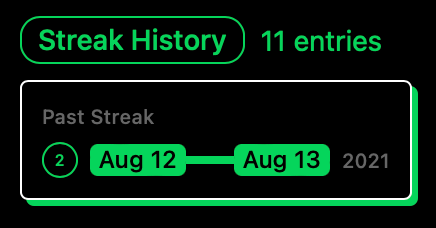 |
| Journal Info | 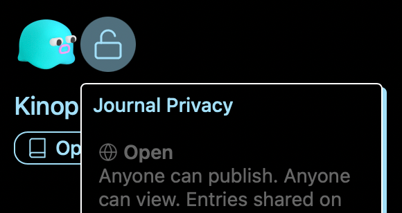 |
|
| Pink | Sharing | 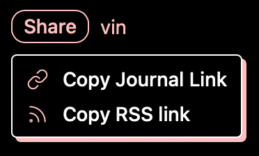 |
| Purple | Writing a New Post | 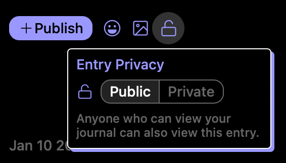 |
| Post Info | 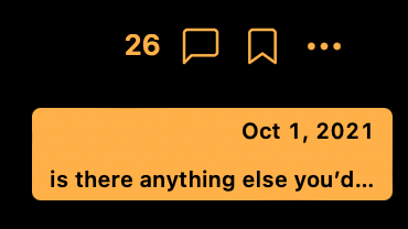 |
|
| Yellow | Scheduling | 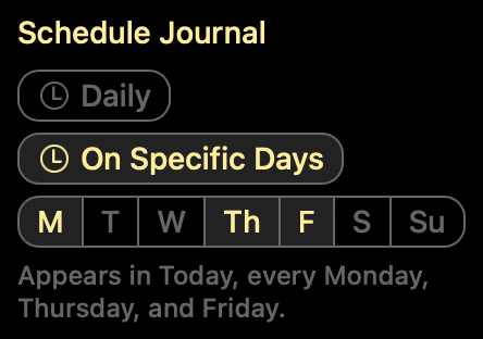 |
I used this system to design self-documenting components that were easy to develop against, and allowed the rest of the team to build new and consistent UI without needing me. Broadly speaking, these include,
| Component | Purpose | Example |
|---|---|---|
| Segmented-Button | Filter results by the selected option | |
| Dialog | Presents item info or editing controls, inherits function color | 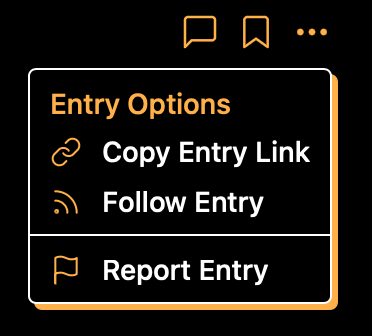 |
| Dialog Inputs | Short text entry in dialogs |
Some Stuff I Did
I was only contracting 1-2 days a week. To make the most of that time, Vin would summarize the community, product, and business problems or aspirations of the week, and I’d tackle these in public in the Futureland.design journal.
We managed to touch almost every part of FL – here are some highlights,
Organizing Journals, Onboarding, and Grouping
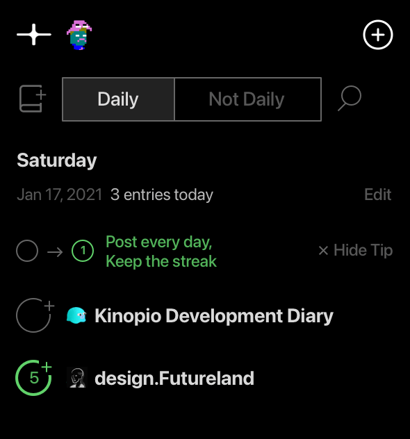
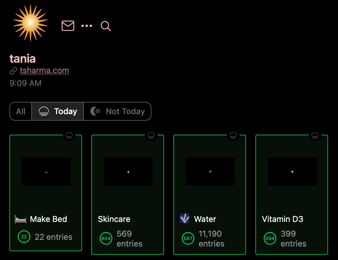
On FL, journals are separated by posting frequency. Journals you post to regularly are Today journals, and everything else is Not Today. Today journals are listed first and show activity streak counts to encourage frequent updates.
The Today, Not Today concept is a little hard to explain though, so dismiss-able inline tips are meant to gently guide new users towards that use, without being dogmatic about it.
Additionally, a welcome journal was added for new users with more in-depth explanations,
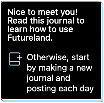
Once people started creating dozens of journals, they wanted more ways to organize them so we added custom groups
Streak History and Scheduling
Posting everyday to a journal increments an activity streak count that is publicly shared.
As people grew ever-higher streak counts, they got more anxious about losing them. Requests started coming in for ways to conditionally forgive missing a streak. In response, others raised concerns about diluting the meaning of a streak.
Public streaks – which therefore have social value – are potentially toxic. But we softened the preciousness and anxiety associated with streaks through:
-
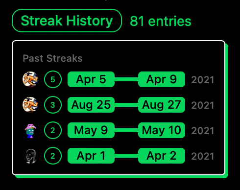
Streak History, so if you lose a streak you’ll still have a record of it that is publicly visible
-
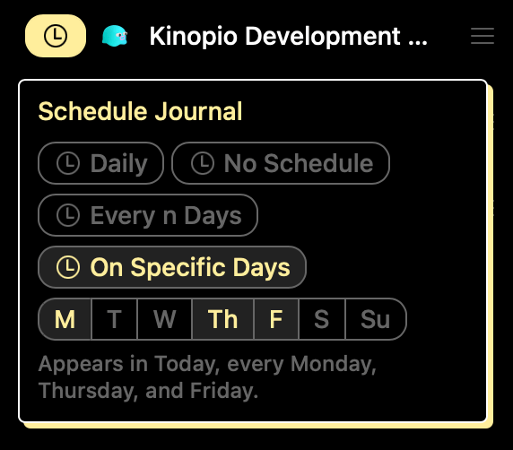
Scheduled Journals, that let you customize streak frequency. This flexibility makes growing streaks easier, reducing their rarity and public value
Posting
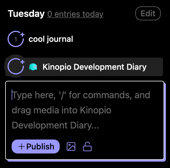
Posting to your journals is the most important interaction on FL. Most posts on FL are short breezy updates, but occasionally someone will publish a couple paragraphs. You’re also able to publish private posts in a public journal.
Building features out as responsive components allows this same interface and code to be reused in other contexts, like quick-posting from in the sidebar,
Interactions ‘Assume Success’ and Complete Immediately
Sometimes feeling fast, is more important than actually being fast. This is especially the case when publishing a new post or comment.
When publishing content on FL, you had to wait until the server successfully responded before you were allowed to do something else. Whether consciously or not, these sorts of penalties for interaction naturally discourage future interactions.
The work here was describing how to eliminate these delays using a principle I like to call assume success,
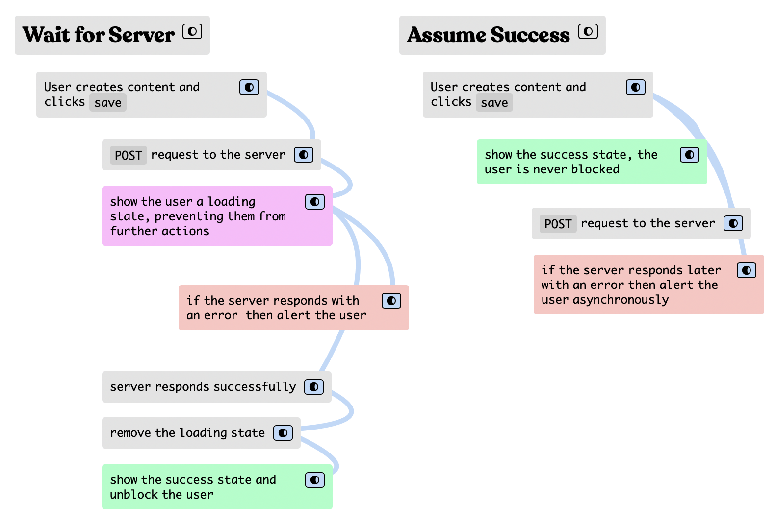
In the rare case that the server responds with an error, FL asynchronously notifies you of the issue and lets you handle it in your own time
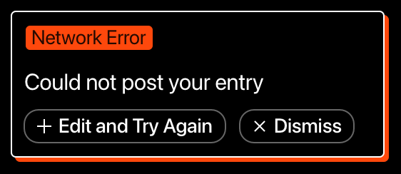
I’m particularly happy with how this turned out IRL, Lucas did a great job implementing this.
The Web App is the Best App
The sum of all these changes and others means that every feature of Futureland is now completely usable on Android and iOS. Having less platform specific code to maintain helps a small team do more with less – hopefully for years to come.
Ending on Some Thoughts on Contracting
I stopped working on FL a couple months ago to refocus on Kinopio full-time.
Looking back, this was my first time working as a contractor. I used a simple time tracking space to track my billable hours, which I’d compile into an invoice at the end of each month or so.
![]()
The main thing I wish I did differently was charge by the day instead of hourly to give myself a bit more breathing room to think long-term without the feeling that I had to make every second count.
So would I do it again? I’m not sure.
On one hand, it was pretty stressful working on two products at the same time. On the other, the perspective from being placed inside the beating heart of another community helped inspire Kinopio features like notifications, and weekly review emails.

It’s not so often in life that you get to help grow a new and promising community. I’ve been lucky (or unlucky) enough to have been here a couple times. The only constant is that it’s different every time.
Working with Futureland was a unique and interesting experience that I’m happy to have been a part of.
 Kinopio
Comments…
Please try again or email me
Or, discuss this post on Hacker News