So over the last couple weeks, I’ve been talking to VCs and founders who have and haven’t taken VC to learn whether it makes sense for Kinopio. I don’t think it does.
I’m open to the idea of selling ~5-10% equity in Kinopio for 💰 to live a smoother life right now. But the relatively-easy money of VCs has a cost – once you get on the VC ferris wheel 🎡, the primary goal of a business changes:
Before “lets make a great product and sell it to people who love it”
After 🎡 “we need fast growth to raise ever-higher rounds of investment until the company gets acquired, so I never have to work again”
This really clicked for me during a chat with someone who recently took VC:
I like what I’m building, and if it dies it’ll be a shame. But it won’t kill me like it’s killing my baby that I would’ve loved to work on for the next 10+ yrs.
Maybe that’s the healthy approach, almost certainly the smart one – but it’s not mine. I want to work on Kinopio for at least a lifetime.
Built to Die, and Secretive About It
Funding models explain why it’s so hard to rely on software services long-term. Not because of technical problems like crashes, but because they’re often built to die.
Interesting, cool, and nice-to-use tools and platforms come out all the time. But it’s annoying to invest the time in learning and relying on something new only for it to get acquired and sunset, or become crappy in the 🎡 pursuit of growth-at-all-costs.
I’ve found that the best way to predict whether software is made to die is to look at how it’s funded. What’s the company’s business model? How will they make money?
It seems like more and more people are explicitly or intuitively becoming more aware of this. But it’s still rare for businesses to share how they’re funded. Advice I got from multiple founders is that if you raise VC, wait 2-3 years to announce it.
On the other-hand, it’s also not that common for self-sufficient businesses to share their business model either. Maybe they’re afraid of looking small, or maybe they think that people don’t care.
Two different kinds of farms can grow vegetables. One is a factory farm built for scale, and the other takes the time to grow more expensive but healthier plants without pesticides.
Will everyone appreciate the difference? Of course not, but the latter plants are labelled ‘organic’ to give us the information and the choice, so that those of us who do care can make better decisions.
Organic Software
So maybe we should have ‘organic’ software as well, made by companies that:
Are not funded in such a way where the primary obligation of the company is to 🎡 chase funding rounds or get acquired (so bootstrapping, crowdfunding, grants, and angel investment are okay)
Have a clear pricing page
Disclose their sources of funding and sources of revenue
And, if you are making organic software, please proudly tell the world because we want to know you’re making something we can rely on.
p.s. I know that software terms like bootstrapped and indie also exist. But these are vaguely defined (is angel investment okay? is having staff okay?), and predominantly speak to founders, instead of to why regular people should care.
p.p.s Thanks to everyone who graciously took the time to talk to me about funding. And special thanks to Aneesha for editing this.
Futureland is a journaling platform that helps you build habits or learn new skills through daily posting and activity streaks.
This is the tale of my redesign of the Futureland (FL) web app over the last year – how I started, what I did, and what I learned.
How I got Involved
I chanced upon FL when looking for a place to write rough thoughts and development diaries that I wanted to share. Creating journals and posting was straight-forward, and I liked it’s light-weight feel, simple aesthetic and tight-knit community,
The original UI
But while trying it out, I kept giving myself paper cuts on confusing parts of the interface,
The sidebar grouped journals under ‘All’,’Daily’, and ‘Shadows’, but it was never explained what these meant
When opening a journal, the sidebar that listed your journals would slide away, with no obvious way to get it back
Opening a journal and completely losing navigation
The cumulative result of these paper cuts was an interface that appeared minimalist but required regular pauses in workflow to remember how to use.
I posted about these issues, in case it was helpful, with no expectation of anything more coming of it. But the founder and lead developer, Vin and Lucas replied, and later on asked if I’d like to help make FL more usable.
My goal has always been to work on Kinopio full-time. But especially back then, the extra money would be very much welcome, to stay alive and occasionally buy nice things.
Making mockups is easy, communicating is hard. So the first thing to do was establish a shared foundation and vision. I started by asking questions to understand the thinking behind the existing design, and by collecting feedback from the community.
FL already had vocal power-users who’d climbed it pretty high up the pyramid by being manually 1:1 onboarded by Vin, but basic usability issues still slowed them down and were a barrier for newcomers.
🕊 The first way to make an interface feel intuitive is by grouping together related controls.
It made sense to do this by making the sidebar the ‘home’ of the interface with new responsibilities,
Primary: Organizing and navigating journals, teaching tips
Secondary: Creating journals, user profile, search, discovery
I started by proposing little adjustments and drawing new icons and controls for basic journal creation and navigation. By necessity, I was already updating the visual appearance of controls to fit inside the sidebar
An early update to the sidebar
Now that the fundamentals were set, this was a good time to step back and shape an aesthetic unique to FL.
I started with Vin’s original inspirations which I described as sleek, graphic, minimalist
We then added new images and commented on what we liked about them,
One of the themes that resonated were bright spot colors,
The phrase ‘colourful abilities’ was also interesting to me
This gave me the idea for tying color to function. Users wouldn’t need this to explicitly explained – they would naturally form associations between like colored controls which would help them parse and learn the interface.
Function Color
Related To
Example
Green
Activity Streaks
Blue
Journal Info
Pink
Sharing
Purple
Writing a New Post
Orange
Post Info
Yellow
Scheduling
I used this system to design self-documenting components that were easy to develop against, and allowed the rest of the team to build new and consistent UI without needing me. Broadly speaking, these include,
Component
Purpose
Example
Segmented-Button
Filter results by the selected option
Dialog
Presents item info or editing controls, inherits function color
Dialog Inputs
Short text entry in dialogs
Some Stuff I Did
I was only contracting 1-2 days a week. To make the most of that time, Vin would summarize the community, product, and business problems or aspirations of the week, and I’d tackle these in public in the Futureland.design journal.
We managed to touch almost every part of FL – here are some highlights,
Organizing Journals, Onboarding, and Grouping
On FL, journals are separated by posting frequency. Journals you post to regularly are Today journals, and everything else is Not Today. Today journals are listed first and show activity streak counts to encourage frequent updates.
The Today, Not Today concept is a little hard to explain though, so dismiss-able inline tips are meant to gently guide new users towards that use, without being dogmatic about it.
Jumping between your ‘Today’ and ‘Not Today’ journals
Additionally, a welcome journal was added for new users with more in-depth explanations,
Once people started creating dozens of journals, they wanted more ways to organize them so we added custom groups
Streak History and Scheduling
Posting everyday to a journal increments an activity streak count that is publicly shared.
As people grew ever-higher streak counts, they got more anxious about losing them. Requests started coming in for ways to conditionally forgive missing a streak. In response, others raised concerns about diluting the meaning of a streak.
Public streaks – which therefore have social value – are potentially toxic. But we softened the preciousness and anxiety associated with streaks through:
Streak History, so if you lose a streak you’ll still have a record of it that is publicly visible
Scheduled Journals, that let you customize streak frequency. This flexibility makes growing streaks easier, reducing their rarity and public value
Posting
Posting to your journals is the most important interaction on FL. Most posts on FL are short breezy updates, but occasionally someone will publish a couple paragraphs. You’re also able to publish private posts in a public journal.
Building features out as responsive components allows this same interface and code to be reused in other contexts, like quick-posting from in the sidebar,
Interactions ‘Assume Success’ and Complete Immediately
Sometimes feeling fast, is more important than actually being fast. This is especially the case when publishing a new post or comment.
When publishing content on FL, you had to wait until the server successfully responded before you were allowed to do something else. Whether consciously or not, these sorts of penalties for interaction naturally discourage future interactions.
The work here was describing how to eliminate these delays using a principle I like to call assume success,
In the rare case that the server responds with an error, FL asynchronously notifies you of the issue and lets you handle it in your own time
I’m particularly happy with how this turned out IRL, Lucas did a great job implementing this.
The Web App is the Best App
The sum of all these changes and others means that every feature of Futureland is now completely usable on Android and iOS. Having less platform specific code to maintain helps a small team do more with less – hopefully for years to come.
Ending on Some Thoughts on Contracting
I stopped working on FL a couple months ago to refocus on Kinopio full-time.
Looking back, this was my first time working as a contractor. I used a simple time tracking space to track my billable hours, which I’d compile into an invoice at the end of each month or so.
The main thing I wish I did differently was charge by the day instead of hourly to give myself a bit more breathing room to think long-term without the feeling that I had to make every second count.
So would I do it again? I’m not sure.
On one hand, it was pretty stressful working on two products at the same time. On the other, the perspective from being placed inside the beating heart of another community helped inspire Kinopio features like notifications, and weekly review emails.
It’s not so often in life that you get to help grow a new and promising community. I’ve been lucky (or unlucky) enough to have been here a couple times. The only constant is that it’s different every time.
Working with Futureland was a unique and interesting experience that I’m happy to have been a part of.
My idea of a vacation might be weird to some. Sure, I like sunshine, I like beaches – but more than all that, I like making stuff with computers.
So I spent my last trip to the west coast scratching my own itches, writing the little dream features and requests that have been floating around in my head for months.
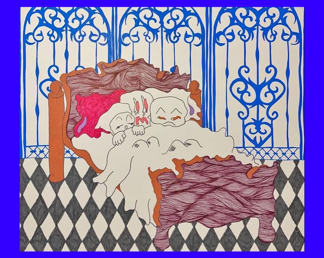
I didn’t want the stress of shipping anything while on vacation, so after I got back I released one of those features per day. I called it “The Week of Sensory Experiments” because of this cool art,
People seemed to really like the busy week, I should do this more often…
Deciding What to Make
My biggest source of ideas is people’s problems or requests on the forums, on discord, or IRL. These take the form of either:
“I need X”, which is straight-forward and just a matter of priority
”I want to do Y”, which doesn’t make sense initially, but finding out the why behind the request leads to something new
”I wish I could do Z”, sometimes I wish I could do Z too, but I need to swirl the idea around in the back of my brain for a couple months before I figure out how to build it in a way that’s performant and works with the Kinopio interface
Equally important are my own dreams – Kinopio is nowhere near complete in my eyes. Maybe it won’t ever be.
So I continually ask myself:
”How can spaces be more expressive?”, more personal, and more fun to use. My goal is for the tool to feel like an extension of your mind
”How can the tool be more usable?”, the more reasons people have to use Kinopio, the more reasons they have to share and invite others to their spaces
I benefit from these in my own spaces. Especially in Life Tasks, where I figure out what I’m doing next, and jot down errands and random ideas and observations,
This is a live embed of my Life Tasks space, I have no idea what this'll look like when you read this. It'll probably be messy like the inside of my head though.
Designing, Coding, Sometimes in That Order
In 2014, I wrote about my belief that design and engineering are best when tightly woven together. That’s truer now than ever.
If I’m feeling confident, I’ll jump right into my text editor and write something like this to create a new controls,
From here, more functionality is added and the code is tweaked until the feature looks and feels right to me. Whether it’s something simple like this, or prototyping a new interaction like multi-connect, there’s no substitute for designing with real code.
In rare cases when I have ideas or plans that I’m less confident about, it’s time to break out the paper, pens, and markers,
The best thing I did last year was decide to only use one notebook for all my Kinopio sketches
Because the Kinopio interface elements and aesthetic are full-grown, I almost never use traditional design software anymore.
Ship It to the World
I keep the review and release process simple – commits are linted, PRs are code-reviewed, branch merges auto-deploy to production.
While coding, I create a list of interactions to manually QA test afterwards. If the change is risky or risqué, I’ll release sneak-peek videos for feedback, and ask beta testers to try it out in a staging environment beforehand.
Marketing
Everything I know about marketing I learned by osmosis in previous jobs. Most software marketing messages are variations on a theme,
“We exist! We can help! We’re really popular! Trust us!”
So many voices… how to stand out?
After a new feature is shipped, I post and tweet about it. With practice, weaving marketing into design and development is starting to feel like a natural part of the cycle.
There’s no shortage of articles with silver bullets like how to double your audience with one cool trick™. But once you strip away the artifice and wipe off the sludge, marketing is just communication – and the best communication informs, inspires, and entertains.
In the case of Kinopio, I hope to convey,
Function, how Kinopio helps you make sense of information in a more engaging way
Beauty, create expressive and interesting spaces that you’ll want to share
Aspiration, using Kinopio helps you turn your problems into solutions, and your ideas into actions
It’s a long road to travel. Like the Oregon Trail, but instead of losing people to dysentery, new friends are jumping on the caravan everyday.
In theory, every marketing website has the same basic job “Here’s what this thing is, here’s how it can help you.”
Beyond that, I hope to vibe with your higher aspirations. “This will help you live the calm, creative life that you yearn for.”
To this end, the three weeks I spent writing, designing, and building the new About Kinopio page almost broke me.
I started with words. If I can make something compelling in a .txt file, that’s a good place to build from. Strangely, I think clearly describing what a product does is probably hardest for the person who made it. But all the feedback I’ve gotten from readers of the Kinopio email bulletin was super helpful in figuring out what themes and use-cases to focus on.
How it Looks, How it Works
Much of my initial inspiration came from going down the rabbit holes of Fonts in Use. Besides finding cool typefaces, there’s a lot of compelling layouts and art direction to be found in the books and posters on the site that we don’t really see on the web.
My design process began by putting the goals I had for the page along with pieces of inspiration in a mood-board space.
Aesthetically, I wanted the page to feel approachable and conventional – but also be memorable and characterful.
The page should feel like a genuine counterpart to the app’s design.
Exude the qualities of craftsmanship and a focus on small details that differentiates Kinopio from more corporate competitors.
For the fonts I was interested in, I tried out free trial versions on the page itself using css @fontface
The page headers are set in the very french Jean Luc. I’ve had this font on my hard drive – and in the back of my mind – for 10 years, and I finally found a use for it.
Contrasting this, the organic and earthy Recoleta is used for headlines.
From here, I poked, then hoped, then tweaked my way towards a layout in the html and css itself. I created new template spaces for each example use-case. And also recorded videos using the macOS screen recorder (⌘-Shift-5) which were then converted to web-friendly mp4 files with Handbrake.
Auto-Paint
Just like with Kinopio itself, I wanted the way you interact with this page to have a little extra somethin’ somethin’.
So, the page paints itself. Kind of like I’m sitting on your shoulder and I’m saying “hey check this out, and also this part is really cool”.
To build auto-painting, I wrote some code that records the x,y position and timings of my paint strokes on the page. On page load, these recorded strokes have their positions transformed to be relative to specific elements on the page. When you scroll those elements into view, auto-painting happens.
Honestly, this was kind of a nightmare. I should’ve chosen an easier profession, like navy seal.
Putting It All Together
Here’s how the page turned out. Weeks from now, after the pain is forgotten, I’ll be really happy with it.