At the dawn of the industry, we needed big companies to deliver quality software. You’d buy version 1.0 because the way it worked was revolutionary, and it let you do amazing new things. You’d buy version 2.0 because it added helpful new features. Apple, Adobe, Microsoft, etc. became household names because software was hard to make, and even harder to box up and get on store shelves.

But by the time version 10~ or so releases, the product includes basically every feature possible. It’s all things to all people.
So how do you make version 11 compelling? The answer turned out to be Lol who cares now. Once you have monopoly market share, the product (and the people that made it) are largely irrelevant. What now keeps the almighty profit line going up and to the right 📈 is sales and marketing – and predictably the relationship between user and tool metamorphoses from symbiotic to parasitic.
The old monopolies aren’t going anywhere. But a new era of tools designed for a different fate are sprouting up out of old, analogue ideas like creativity, purposefulness, human-made craftsmanship.

Domino’s – the Microsoft of pizza – also isn’t going anywhere. But for those who know, and those who care, there’s always a way better neighborhood spot.
Chasing Good Friction
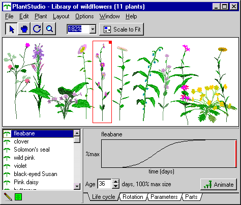
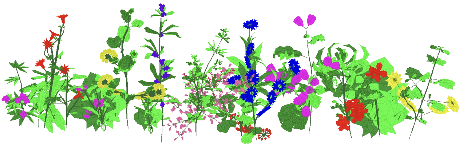
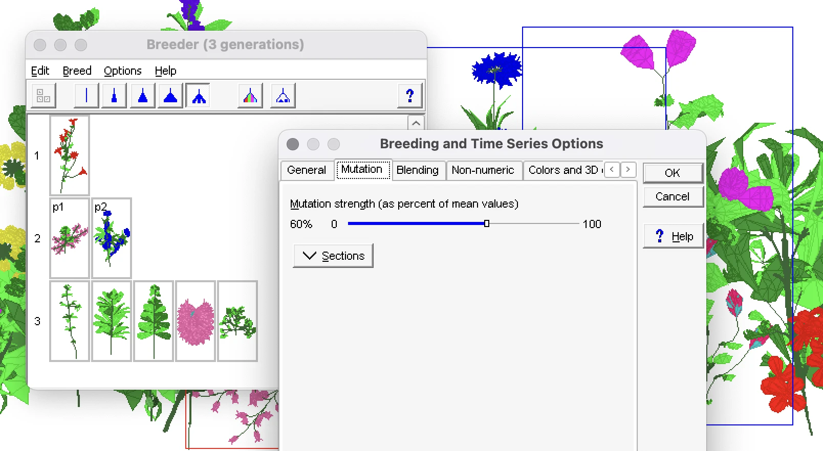
I spend a lot of time thinking about tools for thinking and creativity, and how they’ve changed. If you’re not used to drawing or writing – and even if you are – the scariest thing in the world is a blank page.

The first sentence, or the first brush stroke, is a high anxiety situation. Full of potential, full of unknown pain.
So to help with the blank slate problem, software tools added Templates. File → New turned into File → New → Do You Want to Make a Portfolio? Or a Résumé?. This more recently turned into File → New → Ask AI to Do It. These features help some people, but also create new problems.
These tools can generate almost effortless outputs. They unburden us from the abrasion of creativity and their generic-by-design results keep us cocooned from the risks of standing out. No one wants to make ‘ugly’ art, or a ‘bad’ website. But struggling and making mistakes is an important part of developing skills and – increasingly important – finding your own voice.

We don’t talk enough about the many-years-long rite of passage that every creator goes through.
Everyone can draw or write, but only the smallest sliver will decide that they want to earnestly make things to share with other people.
At whatever age it grips you though, the urge to create pulls you into a world of frustration, where your skills don’t yet match your taste and everything you try feels not good enough. Unfortunately, the first step to being good at something is to suck at it.
But the expedition is especially dispiriting when your tools constantly wink at you to generate ‘perfect’ results instantly.
Why did I spend two+ painful weeks writing a blog post?
For the Journey
I don’t write very often, so I’m not sure if my pace is glacial or merely tortoise-like. Then again Tolkien took 12+ years to write The Lord of the Rings.
Speaking for myself, even after I plan things out, the shape of an essay (sometimes even my whole argument) changes as I write.
I type with two IA Writer text editor windows open. One for the post, and one where I throw rejected or tangential paragraphs and ideas that don’t quite fit. So far, each file contains ~2000 words… implying that I throw away ~half of what I type.

From a short-term-results point of view, this process may seem inefficient, painful, and somewhat savage. I wouldn’t really disagree – but, like working out, or eating well, the sweat and tears are worth it in the long-term because I solidify my ideas with every new post I write.
Even after all that work, it’s never as good as I want to be – especially considering the effort. I’m still always a little bit embarrassed to share my work, because it’s never ‘perfect’.
But it’s better than perfect, it’s imperfect.
Struggling is an important part of developing skills and finding your own voice, and having an audience that’s watched your work evolve over years is a slept on privilege.
The Human-Tools Era
When you’re excited about a new hammer, everything looks like a nail. In the case of LLMs, just a year or two ago investors couldn’t catapult money fast enough at anyone incanting the magic letters A and I. Now that the dust is settling, I suspect we’ll look back at AI as something that was good(ish) at summarizing text and image recognition – but was used to make everything in the world harder to understand, less fun, and worse.
More so now than ever before, making something yourself that you fully understand is deeply empowering. As the world gets noisier, glossier, and more fake, the more valuable the human-touch becomes in both the real world and on the real web.
LLMs are the new normal. “Easy to use” became “let me tell you what to write and how to draw”, “here’s what you’ll watch next”, and “here’s what you believe”.
But there is always be a market for understandable, engaging, and fun-to-use tools.
| What Most People Use | What Enthusiasts Use |
|---|---|
| Phone camera | Dedicated camera |
| Whatever pen is nearby | Fountain pen |
| The keyboard that came with your computer | Mechanical Keyboard |
| Coors Light™ | Craft brew |
| Smart watch | Non-smart watch |
| Fast fashion | hand-made knitwear |

In your heart, you probably can’t be an enthusiast for everything. I like cool cameras, I don’t care about wine (TBH I’ll happily drink Coors Light™), and obviously I care about good software. Let me add a row:
| What Most People Use | What Enthusiasts Use |
|---|---|
| Software that generates quick results for you | Software that gives you the time, space, and encouragement to do your best work |
When it comes to thinking through problems, working through projects, or expressing yourself, special tools aren’t a necessity – but they can make the journey a lot more fun.
Doing things a little differently makes the results more imperfect and personal. Being authentically you is what makes the journey worthwhile.
Special thanks to Aneesha and Ben for helping edit this.