There’s never been just one way to buy software. In ye olden times, if you liked some shareware, you’d mail off a cheque, or call up a hot-line, to get the full version. Later on, you could walk into a store and walk out with a shiny box, manuals, and disks.

These were some expensive boxes:
| Name | Year | Price | 2025 Equivalent |
|---|---|---|---|
| Adobe Photoshop 3.0 | 1994 | $895 | ~$1,956 |
| BBEdit | 1993 | $120 | ~$250 |
| CorelDRAW 5 | 1994 | $595 | ~$1,300 |
| Final Cut Pro 1.0 | 1999 | $1,000 | ~$1,850 |
| HyperCard | 1995 | $120 | ~$250 |
| Kid Pix | 1991 | $50 | ~$112 |
| MacWrite Pro | 1993 | $120 | ~$315 |
| MS Office | 1995 | $500 | ~$1,025 |
| MS Windows | 1995 | $210 | ~$450 |
No one technically had to upgrade, but in a year or so, everybody did, because we wanted those sweet quality-of-life improvements, nicer design, and exciting new features. But eventually every product being continually developed will become good enough for its target market.
When that happens, companies (especially the VC-backed kind) now need to contrive new and increasingly stick-like reasons for customers to pay again. From made-for-marketing ‘features’ that suck to use IRL, to breaking compatibility with older versions, to spamming you with marketing notifications and embedded ads. Their relationship with customers goes from symbiotic to parasitic.
On the other hand, the pursuit of completeness should be an ideal fit for subscription software because, theoretically, steady monthly payments from long-time customers incentivizes stability, polish, and helpful improvements.
Subscriptions are particularly helpful for businesses:
- Monthly Recurring Revenue (MRR) makes it way easier for a business to hire employees because they know they’ll be able to pay their yearly salaries.
- Historical MRR can be used to project the rate at which future revenue will go up 📈, which could be used to take on some debt to finance expansion or R&D as safely as possible.
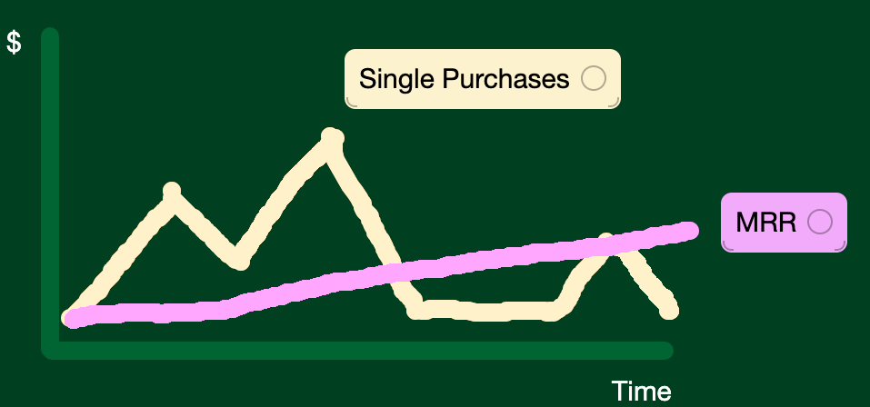
Especially for solo creators, just knowing that you have ~$3000/mo coming in every month is way less anxiety-inducing than making $6,000 in a good month – but knowing that next month you could just as likely make $1000, or maybe even $0. It’s like being a farmer, surviving at the mercy of good weather.

There’s also a third reason: Tier or usage-based pricing prevents customers costing more money than they contribute. But unless you’re burning unlimited money generating LLM tokens, the risk of losing money on a web app customer is either basically zero, or very easy to predict otherwise (even over the long-term).
On paper, subscriptions could be a win-win. But some people, including many readers of this blog, have good reasons to be wary of them.
Subscription Woes
Kinopio subscriptions can be easily cancelled, pricing is grandfathered, receipts are emailed, accidental renewals can be refunded, and there are no cancellation fees or deceptive dark patterns. Many indie subscription apps also offer subscriptions in good faith.
But a business model that’s regularly exploited by well-known corporations, like the New York Times and Adobe, poisons the well for everyone else. Every time someone gets tricked into signing up for a non-refundable yearly subscription instead of a monthly one, or has to call to cancel a subscription they created online, those bad feelings become associated with all subscriptions.
It’s hard to have good long-lasting relationships with customers if they’re expecting the worst.
That being said, I still think subscriptions make sense to offer.
For most people, subscriptions are as normal as the old boxed software model used to be. And the much lower-cost to entry can be very helpful – especially in competitive markets where customers have a lot of options.
The onus is on companies selling subscriptions to earn trust by being transparent about who they are, what they believe, and how they’re funded (i.e. what their long-term incentives are). A public roadmap and changelog also go a long-way towards proving they practice what they preach.
Even to non-technical people, paying for subscriptions makes intuitive sense when the product requires a server for helpful things like file uploads, public URLs, and real-time collaboration. But the per-user-cost of running a production CRUD server is basically zero. Counter-intuitively, what you’re really paying for is the considerable effort and expertise that it takes to keep full-featured software running reliably and continuously-improving.
That’s part of the reason why I increased prices over the years as the app grew in capability and complexity.
How I Priced Kinopio
For context, here’s Kinopio’s pricing history:
| Year | Prices |
|---|---|
| 2019 | $0 |
| 2020 | $4/mo |
| 2021 | $5/mo |
| 2022 | $6/mo, $60/yr, $200/life |
| 2025 | $8/mo, $80/yr, $250/life |
When I introduced paid upgrades to Kinopio in 2020, I did it as a monthly subscription because that seemed like the safe, default model for an app that needed a server.
In all my previous jobs, there was always a dedicated back-end or sysadmin team that abstracted the server hosting details from the rest of the company. They used complicated sounding terms like load balancing, replica shards, containers, observability, were woken up by pagerDuty, and were eternally worried about scaling.
But when I dived into that world, I learned that most of the jargon really didn’t matter. The kinopio-server is a simple node.js app with a pretty straightforward MVC architecture. My insecurity about keeping servers up is a big reason behind why the app works offline, or if the server is down. What developers would call local-first today.

In 2019, I wrote about my early Plans for Kinopio. Where I mentioned that,
“Kinopio consists of two codebases, the
client-appthat runs when in the browser and theserver-appwhich enables sharing and collaboration. The client is like a cockroach, its tiny, basically free to host, and doesn’t depend on a connection to the server. So if I can’t afford to run the Kinopio server anymore, I can just switch it off and you can continue to use Kinopio as you do now – with all your data intact.”
Two years later, I introduced the lifetime plan mainly because people kept asking me for a subscription alternative. I’m sure many of them would have still have paid for a subscription, but how long would a rueful customer stay? Would they always be looking for alternatives? Would they still enthusiastically share spaces and recommend the app to their friends and teams?
My business ‘strategy’ is that a happy customer is better than an unhappy one, and that I’d rather have some money from a user than none. (Relatedly, that’s also why Kinopio offers student/financial needs discounts).
The lifetime plan is priced at ~3× the yearly price because that was the average churn length at the time. But I think that in general, 3-4 years is a good starting point if you get a nice sounding number that is high enough so that only <10% of new customers choose it, while stilling feeling anchored to the subscription prices.
Financial Engineering, for Good
Software designers and engineers regularly build products with original ideas, and choose to make their own jobs harder by increasing code complexity, so that their users can have an inviting, easier-to-use, and lower-friction, time using it.
But on the financial-side, web-based software companies tend to be really conservative with their business models and choose subscription-only models by default. It’s never even questioned, but I think it should be. Just like with dev work, pricing models can also take on behind-the-scenes complexity to give users a better experience.
Low-variability/high-tail income (subscription MRR) is easiest to plan for, but high-variability/short-tail income (lifetime purchases) is peaky and harder to plan for – but they can work together. If you position and price it right, the ideal customers for lifetime pricing will be very different than the ideal subscription customers.
It may sound counter-intuitive to give your most passionate users a pathway to never have to pay you again, but especially early on, evangelism is worth more than money. There are plenty of fish in the sea: people who have yet to find, or be recommended, Kinopio and become future customers.