A couple months ago, I wrote a short piece for the Sublime zine about my vision for collaboration,
What if We Could See Each Other’s Thoughts?
When you asked me to do something, I would know why you think it matters. If I told you my plan, you would know the thinking behind it.
Instead of debating what to do, we could discuss why we need to do it. Instead of hiding behind a powerpoint proclamation, we could share our truer selves, and our rougher thoughts, and figure it out together.
The curse of humanity is that we can’t read minds, but we do need to work together. Every company I’ve ever worked with has struggled to connect what we need to do, to why we need to do it.
This is where whiteboarding comes in. The combination of writing and drawing anywhere you want can help us build ideas and solve problems together. No two whiteboards are the same because no two problems are ever the same.

Collaborating like this, in the spirit of openness and vulnerability, we can share our goals, assumptions and ideas, we can ask questions, make plans, have fun, and learn to trust each other.
Unless you’re unlucky enough to be using an enterprise software whiteboard.
Designing for the Journey
Here’s the prettiest screenshot for Miro I could find, taken from its marketing site, illustrating its many features in use,
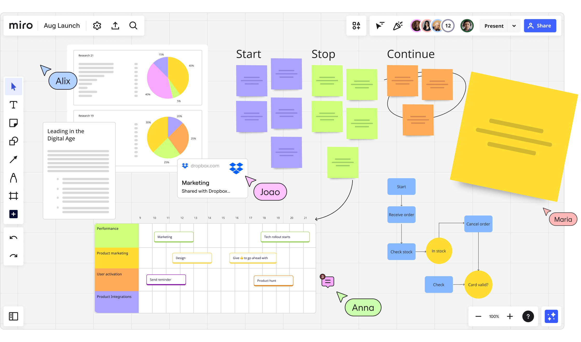
Let’s say I have a cool idea you want to share with the group. Hold on, I’ve got some decisions to make first:
- I want to type my idea so I’ll use the Text tool
- Oh wait, should I add a Sticky Note instead? What’s the difference? Which pastel color should I choose in the sub-options that appear?
- Oh nooo, I clicked on the
+button and 30+ additional tools popped up (seriously click that link, the list is nuts). Umm, what’s a Card? How is it different from a Text or Sticky Note? - I see multiple Diagram, Flow Chart, and Mindmapping tools. So if I want to add an idea that’s connected to another idea, do I need to use one of those?
- What was my idea again?
This “what if design app, but business?” kitchen-sink UI makes it possible to produce high-fidelity diagrams and flowcharts – but it also ruins the whole point of a whiteboard. (Also, at this point, why am I not just using a real design tool?)
Drawing and writing on a physical whiteboard is a mode-less experience that anyone can do. Being at least as easy, expressive, and fun as a $10 sheet of plastic and some markers is the bare minimum that a software whiteboard should be.
Unlike text documents and spreadsheets whose general shapes were settled pretty early on, collaborative digital whiteboards have only been around for ~15 years or so.
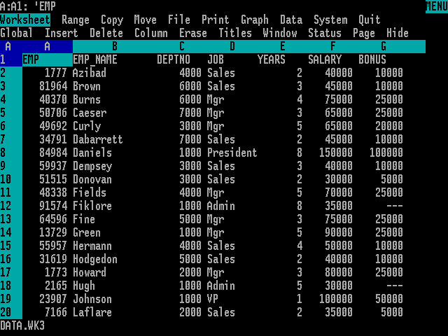
Despite this, every app in this space follows the same dreary UI playbook. Maybe that’s the nature of enterprise apps for the fortune 500, but why should the rest of us suffer? I think we can do better.
Wide Interfaces vs Deep Ones
As products gain features their interfaces can grow either wider or deeper to accommodate them. It’s kind of like a lake,

Wide interfaces show you every tool and control upfront to make them easy to discover and quick to access. But as the number of options increases, they become visually overwhelming, requiring designers to stuff some things into submenus.
In the right context, this is great. Wide interfaces are ideal for specialized professional tools designed to produce high-fidelity outputs like pixel-perfect mockups, millimetre-accurate architectural plans, and complex 3D models.
Pro tools take a lot of time to learn, but they’re usually critical to your profession, so that’s time well spent.
But the same qualities that make them powerful for professionals, also makes them prickly for cross-discipline collaboration. Complex tools elevate experts and intimidate novice users from making unique contributions, nurturing groupthink.
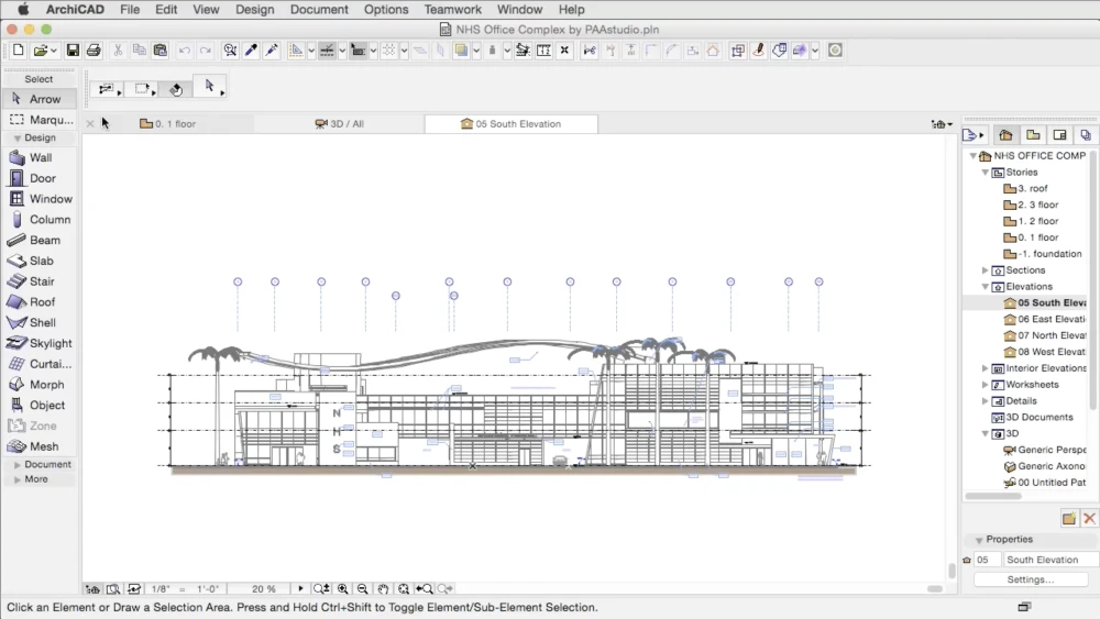
wall tool to draw a wall, the window tool to add a window, and so on. Expressive for architects, daunting to everyone else.
Deep interfaces, on the other hand, present fewer controls upfront. More advanced features reveal themselves contextually as you add content.
Because these interfaces are easier to start using, they’re better for collaboration with a wide range of people and a wide range of skill sets. Everyone feels more welcome to contribute when the barriers are low.
Like a physical whiteboard, the outputs produced this way tend to be lower-fidelity and conceptual – ideal for problem solving and consensus building.
The downside of deep design is that advanced features are inherently harder to discover. Good help docs and sharing examples of advanced use can go a long way though.
The other challenge is that you can’t just wedge new feature buttons into a toolbar. You have to think through how features could be invoked contextually – and be okay with some features taking longer for users to unearth.
In practice, almost every app has a mix of wide and deep interface design decisions. Now that you can recognize them, you’ll see these patterns everywhere. Sorry about that.
Eternally WIP
When Kinopio was born 5 years ago, whiteboarding wasn’t on my radar, so its design comes from a totally different place.
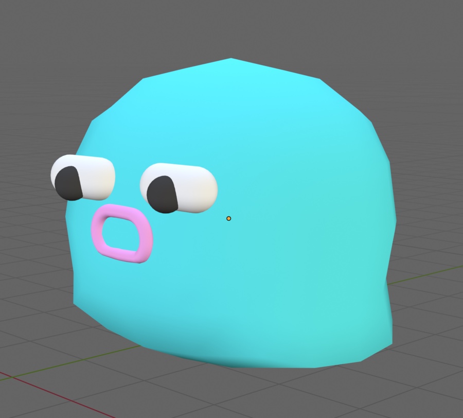
In 2019, I introduced Kinopio, why I made it, and how to use it in Hello Kinopio. I think I got a lot right from the start.
Early on, I noticed that those who use Kinopio the most, also use it at work. It’s really motivating to see people using the tool I created to help shape the kinds of teams and companies that I’d love to work for.
Kinopio isn’t for the Fortune 500 – there’s plenty of enterprise options for them. I’m personally drawn to the people and teams who care about using great tools because they take pride in their work.
Ultimately, my goal is to create something that’s so effortless and toy-like you’ll invent new reasons to sink into it with your friends and teammates.

Special thanks to Aneesha and Kevin for helping edit this.
 Kinopio
Comments…
Please try again or email me
Or, discuss this post on Hacker News