In theory, every marketing website has the same basic job “Here’s what this thing is, here’s how it can help you.”
Beyond that, I hope to vibe with your higher aspirations. “This will help you live the calm, creative life that you yearn for.”

To this end, the three weeks I spent writing, designing, and building the new About Kinopio page almost broke me.
I started with words. If I can make something compelling in a .txt file, that’s a good place to build from. Strangely, I think clearly describing what a product does is probably hardest for the person who made it. But all the feedback I’ve gotten from readers of the Kinopio email bulletin was super helpful in figuring out what themes and use-cases to focus on.
How it Looks, How it Works
Much of my initial inspiration came from going down the rabbit holes of Fonts in Use. Besides finding cool typefaces, there’s a lot of compelling layouts and art direction to be found in the books and posters on the site that we don’t really see on the web.
My design process began by putting the goals I had for the page along with pieces of inspiration in a mood-board space.
- Aesthetically, I wanted the page to feel approachable and conventional – but also be memorable and characterful.
- The page should feel like a genuine counterpart to the app’s design.
- Exude the qualities of craftsmanship and a focus on small details that differentiates Kinopio from more corporate competitors.
For the fonts I was interested in, I tried out free trial versions on the page itself using css @fontface
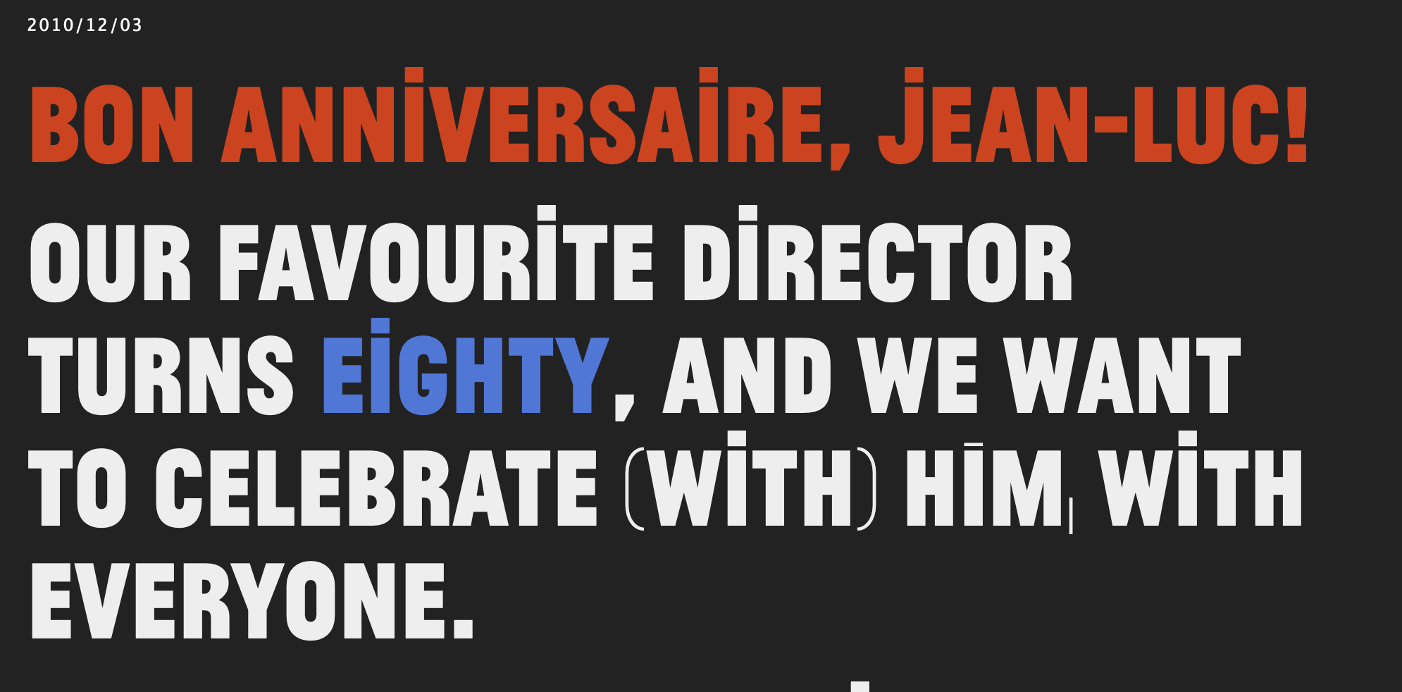
The page headers are set in the very french Jean Luc. I’ve had this font on my hard drive – and in the back of my mind – for 10 years, and I finally found a use for it.

Contrasting this, the organic and earthy Recoleta is used for headlines.

From here, I poked, then hoped, then tweaked my way towards a layout in the html and css itself. I created new template spaces for each example use-case. And also recorded videos using the macOS screen recorder (⌘-Shift-5) which were then converted to web-friendly mp4 files with Handbrake.

Auto-Paint
Just like with Kinopio itself, I wanted the way you interact with this page to have a little extra somethin’ somethin’.
So, the page paints itself. Kind of like I’m sitting on your shoulder and I’m saying “hey check this out, and also this part is really cool”.
![]() To build auto-painting, I wrote some code that records the x,y position and timings of my paint strokes on the page. On page load, these recorded strokes have their positions transformed to be relative to specific elements on the page. When you scroll those elements into view, auto-painting happens.
To build auto-painting, I wrote some code that records the x,y position and timings of my paint strokes on the page. On page load, these recorded strokes have their positions transformed to be relative to specific elements on the page. When you scroll those elements into view, auto-painting happens.
Honestly, this was kind of a nightmare. I should’ve chosen an easier profession, like navy seal.

Putting It All Together
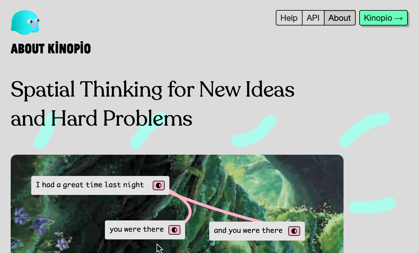
Here’s how the page turned out. Weeks from now, after the pain is forgotten, I’ll be really happy with it.
 Kinopio
Comments…
Please try again or email me