In software, like with art and fashion, sometimes what’s old is new again. When it comes to playful creative software, Kid Pix is a kind of software product we don’t see much anymore.
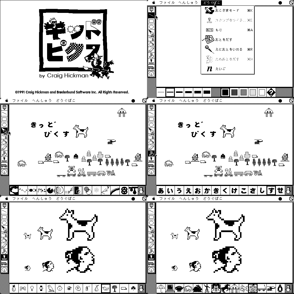
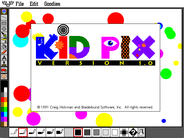
In 1989, Craig Hickman released Kid Pix for his infant son who enjoyed Mac Paint on the original Macintosh, but because he wasn’t able to read yet, struggled with the menus and traditional art tool (brushes, paints, pens) based UI metaphors. Kid Pix is charming and engaging in a way that’s aged remarkably well.
The first time I used Kid Pix it had color and I was a wee tyke in grade 4. It definitely made an impact, probably for no other reason than because it was fun, and had wacky sound effects. Kids are easy that way.
Looking back on it, Hickman was the rarest of people who type things for a living. Both a talented programmer and an ace designer who used empathy and observation to build a creation tool with a real sense of fun, whimsy and imagination.

According to his handy retrospective, Hickman designed Kid Pix around some interesting principles:
- Every feature should either be obvious or should explain itself through use.
- Be satisfying to use by making the process of drawing as important as the picture created.
- The program would include tools that would be surprising and visually unusual. Things like like effect filters, stickers and stamps that weren’t based on traditional art tools.
- The eraser should be whimsical. Because reasons. And because destruction should be as fun as creation.
- Uses system standard UI conventions to help users new to computers learn basic principles.
I’ve learned in the last couple months how important laying-out and describing your product principles upfront can be. It’s work that pays for itself over and over again – especially when you add teammates.
Good principles force you to make tough, sometimes moral, choices upfront based on what personally feels right. They may not be perfect from the start, but just like life, changing as you grow and learn new things is totally cool.

In grade 4, Kid Pix was simply a good time with colors.
20 or so years later, it still is. But now it’s obvious how good Hickman really was. His process was timeless, so was the result.
 Kinopio
Comments…
Please try again or email me