🎹 Updated to replace HyperDev with Glitch
So last week (in 2016) we launched Glitch (then known as HyperDev/Gomix), a cool way to write a real web-app. It’s been almost a year since DanielX and I first presented the idea to FogCreek.
Let’s look back 👀✨
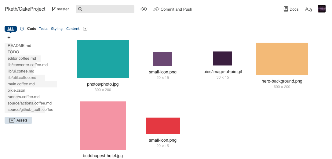
If you turn off the lights, squeeze a lemon in your eye, and squint real hard, you might see some similarities to Glitch today. The asset management stuff wasn’t too far off though.
Real rough, but good enough to help us convey our vision for web development without the boring parts.
The next thing we were told to do is come up with some high-level product principles. These also started rough, but we’ve sharpened them up over time – and as the team has grown:
- Be the fastest, easiest way to get your own web app and start working on it.
- Glitch is real coding. Copy and pasting an answer from Stack should just work like it would on your local machine. If you want, you can take your code and run it on Heroku or wherever.
- You should get instant, direct feedback when you edit your app.
- You should always feel safe that you won’t lose your work and that you can try crazy ideas without irreversibly breaking your project.
- The editor should be a fun place to be because it’s fast, approachable and puts the emphasis on your content and your team.
(Secret principle #6 is steal from Trello whenever possible)
While we haven’t nailed all of these yet, we’re steadily working towards them.
Having these tentpoles made it easier for us prioritize and push for doing the right things – and to figure out what to cut:
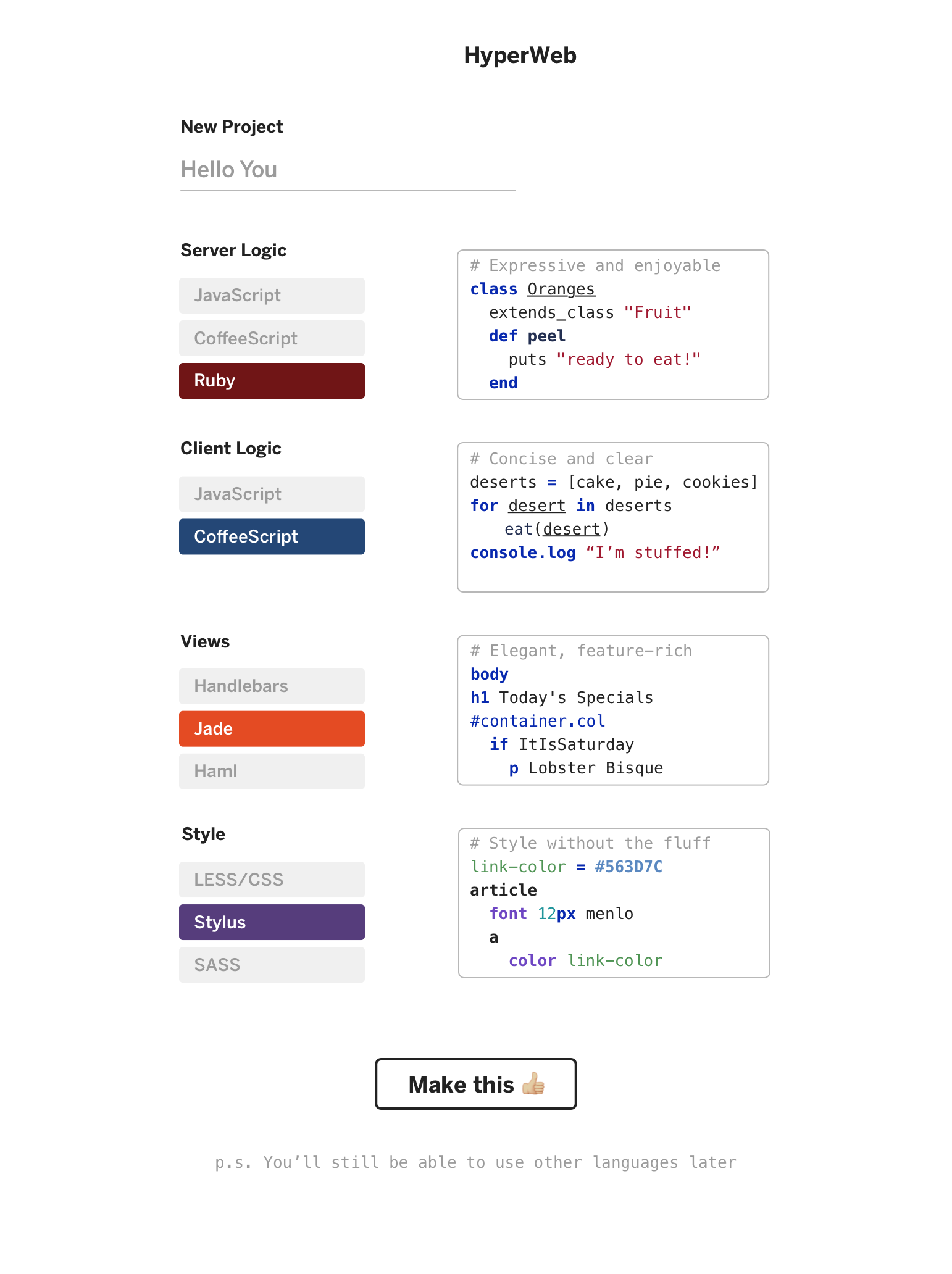
New Project Setup 👎:

Early on, starting a new project meant making a couple of tough feeling choices. And instead of actually making something, you’d be off researching the joys of Ruby, debating it’s performance and wondering whether you should use Ember, Angular or whatever’s hot on the streets this month.
This was also an example of us being too opinionated and trying to be too prescriptive about the ‘best way’ to code.
This clearly violated our first product principle of getting you started fast. So throwing this out and relying on our users to make interesting, remix-able projects felt like a better call.
Sidenote: I thought using emojis as an interface element would be at least slightly controversial in 2015. 🌈.
Inserting Snippets For Common Tasks 👎:
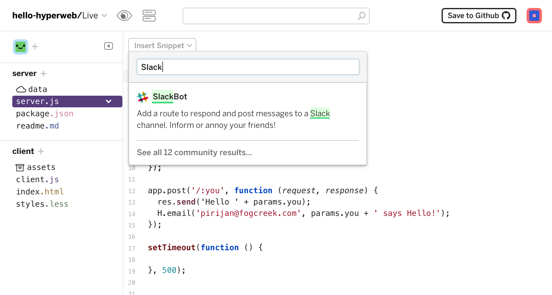
To make it easier to do common coding tasks, I wrote a feature that would let you search and insert pre-made code snippets into your document to do things like init a Slack bot in a js file or scaffold an animation with keyframes in some css.
This made sense in theory, and was easy to sell people on as a magical feature, but it turned out to be too magical to actually be good:
In user tests, no one seemed to know what they expected the feature to do. In FogCreek hackathons, nobody really used it even after they were told what it did.
There were also a lot of hard, scary questions around this feature like:
- Where would the snippets come from? Who would write and maintain them?
- How would we do non-trivial snippets that required changes across multiple files? (Silently editing files the user couldn’t see sounded sketchy.)
- Should we add packages to projects if a snippet required it?
- Would we be endlessly porting and updating snippets people relied on?
So eventually we cut the scope of this and simplified it into the ‘Add Packages’ button that appears when you’re in package.json. This feels way more predictable, and will be way easier to maintain and adapt to other languages and package management systems.
On-the-fly Language Selection 👎:
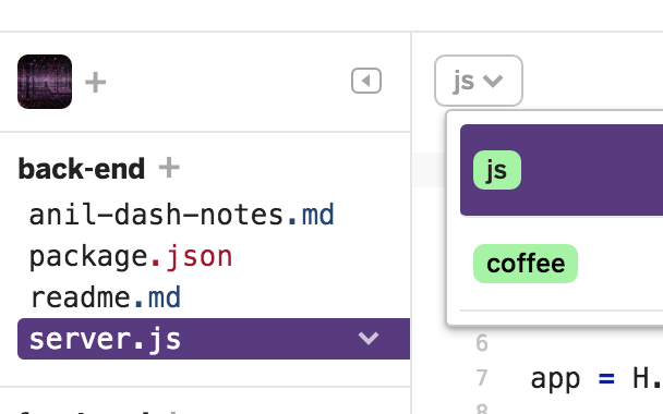
Another feature that lived for months in the beta was the ability to change the language of your document and have it auto-magically just work. So if I was in a js file and I wanted to step up my game, I could select coffee and be cool AF.
Language selection made it easy to experiment with languages and was a nice, contextual way to show users our currently supported languages. People seemed to like it. When it worked.
In order to do this you had to be using our hyperweb-init library in your project. hw-init did a bunch of things, like setting up express, language compilation and watching. In theory, I thought this might make getting started easier because new users wouldn’t have to trace through boilerplate init code in server.js
If you’ve ever started an XCode project with Core Data support, you know how shitty boilerplate code can be.
But actually what happened in testing is that people actually felt less comfortable when they couldn’t see their express init code. Again we crossed over into too magical territory.
Additionally, going from something like js to coffee was easy, but what about from coffee to python? How would hyperweb-init work in other languages that might not have existing libs for server-side compilation of coffee or less? If I changed server.js to swift, what impacts does/should that have on package management?
*phew* When your edge-cases have so many branching paths that they start to resemble an AI problem, it’s time to step back and try something else.
Over the next couple months we slowly trimmed the fat off the welcome-project, and removed any first-party dependencies to better walk the line between simple and transparent.
Wrapping Up For Now
So we talked about some things, had some laughs. But I’ve still got so many more Glitch rabbit holes to dive into for later posts.
In the meantime, If you’re curious, all of my design files are up on github. glitch.sketch is the window into my soul: it’s a little bit of a trash fire in there, but it’s pretty entertaining. I wear my inspirations on my sleeve in these files.
 Glitch-design on github