Fit Report is a simple fitness visualization I made for myself that tracks my daily workout and nutrition activity and correlates that to how I feel.
The visualization attempts to app correlate mood, with whether I worked out and ate well that day. worked out, ate well and good mood are deliberately qualitative metrics which get redefined as I get fitter. A 5k run might be the workout of a lifetime for one person and a warm up for someone more experienced.
Over time, I’ve had to increase the frequency, intensity and variety of my workouts and get ever stricter about nutrition. This approach sees fitness more like a marathon than a sprint.
How it works
There’s far more detail on the github page, but here’s the gist:
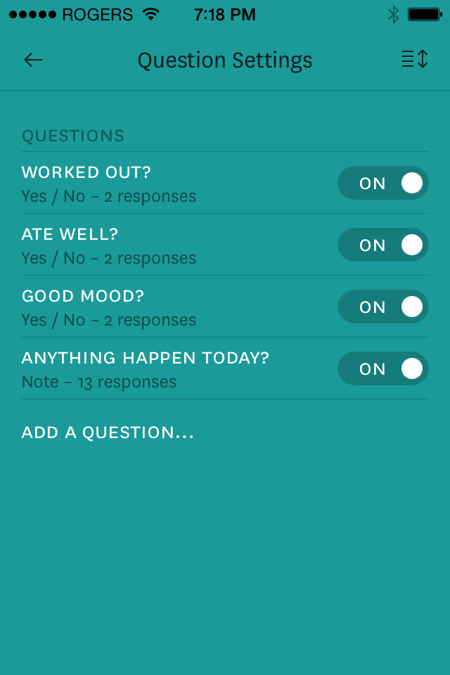
The data for the Fit Report is recorded nightly using Reporter for iPhone. I choose to use Reporter because it’s the nicest, quickest way to answer simple questions on my phone and get JSON exported. The questions are set up like so:
Then a local shell script cleans things up and uploads the result, which is then processed by the Fit Report webapp to render the visualization.
(Writing shell scripts is the worst).
Purposeful Tracking
I’ve been working out for years now. In that time, I’ve fallen into my share of ruts – times of sloth or plateaus in my progress. But even looking back, I still don’t really know why.
Fit Report is tied to the hypothesis that how consistently I work out and eat well is strongly correlated to my mood and mental wellness. By being able to quickly identify these patterns, I’ve already been able to better understand the complex relationship between these three factors.
Translating time-series activity into visual patterns should also give me an earlier indication of when I’ve hit a fitness plateau. If I’m reporting a good activity streak but my mood or notes imply meh-fulness, I’m probably in a slump and should up my game or try something new.
Ultimately, the hope is that, by shining a light on my activity patterns, I’ll be able to tackle the root causes of defeat, instead of just the symptoms.
One size fits you
I think there’s a place for something between the worlds of passive wearable tech and hyper-accurate detailed manual tracking. Just like the endless ways to workout, everybody is going to have something that works best for them.
Fit Report is a purposefully simple and unrefined tool, because I built it for myself. Also, over-thinking things puts me in a bad mood.
 Fit Report on github