I’m a huge fan of pain and pixels. So, inevitably, I’m a huge fan of Nicalis and their games.
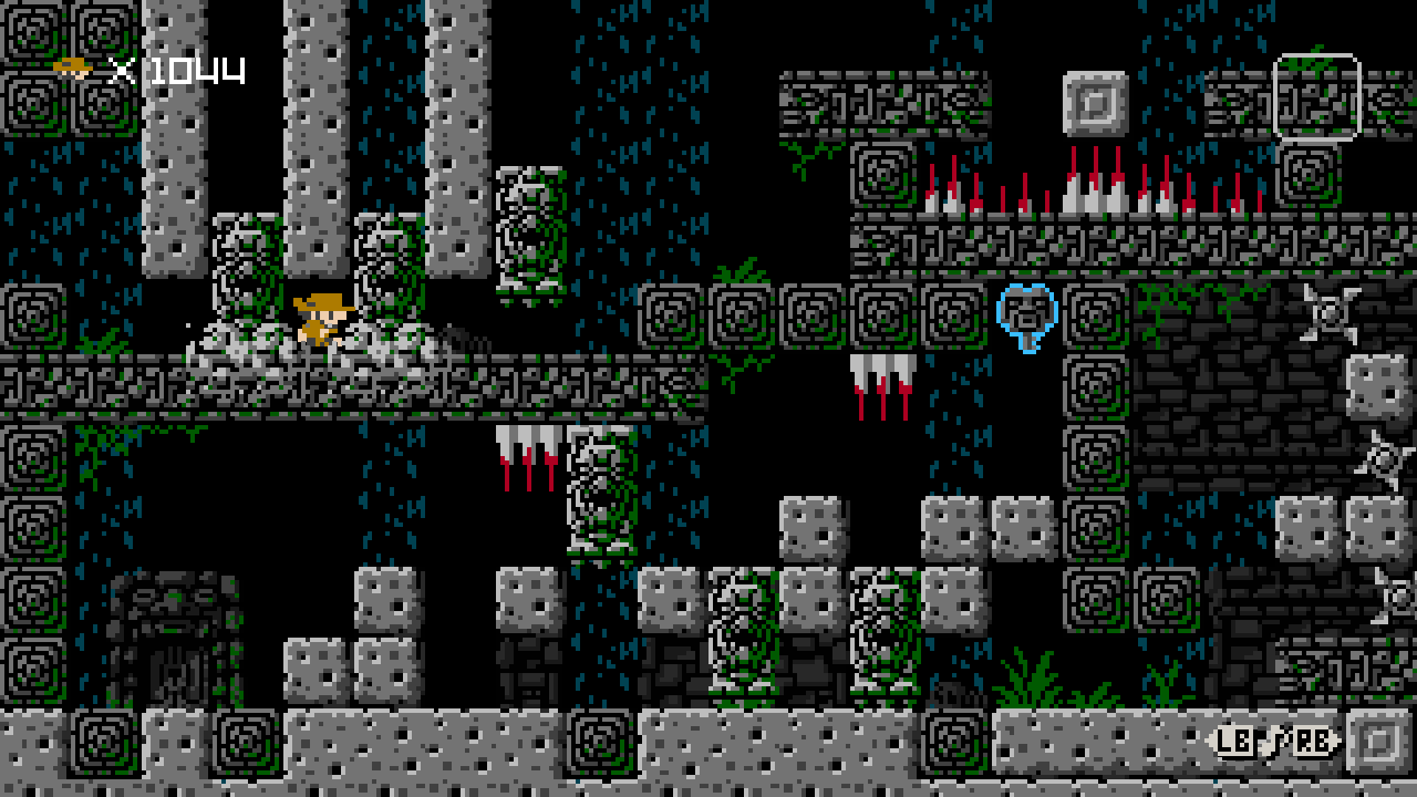
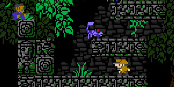
1001 Spikes is a game of endless danger, where death is both inevitable and constant. Each new life is a chance to learn from your previous mistake of tripping a hidden spike trap – only to get an arrow through the heart.

You could say 1001 Spikes is a game about failure, but it’s just as much about reveling in each small victory. 1001 Spikes teaches the player through failure - death is expected (sometimes even cute), and rebirth is immediate. As the lessons from each death bring you closer to the goal, you’ll start to move with confidence. You’ll know when to wait and when to run, when to jump and when to fall.
For that brief moment, it’ll all be worth it.
For the tenacious, nothing is impossible.
— Jonathan Holmes
Then you’ll make it to the next stage and do it all over again.
So what did we learn?
Honestly, I’m not totally sure. In a game, failure can be a teaching tool, even a reward, but in product design we fear failure. We don’t want users to fail - or even know they can fail. When a user fails to immediately do something or understand something, we also see it as our failure. This seems to make perfect sense.
But compared with games like 1001 Spikes, our status quo tools for ‘safely’ teaching users - intro screens and pop-up tutorials - feel clumsy and immature. As designers, embracing the possibility of failure opens up the way we teach.
Instead of telling users what all the things do upfront, start them with some hello world style content that’s self documenting. Let them mold it to their needs or blow it out and start fresh. They might mess up but instant feedback coupled with endearing failure states will keep them coming back.

 Kinopio
Comments…
Please try again or email me